
Color Grading Guide | Davinci Resolve
Welcome to this absolutely free comprehensive color grading course. I’ve tried to supply you with as much content as possible. If you have any questions, head to the “Contact Me” section and ask away. Ready? Here we go!
In the world of video production, few elements are as crucial to storytelling as color. Whether you’re crafting a cinematic masterpiece or creating content for social media, color can evoke emotion, set the tone, and elevate the overall impact of your visuals. But achieving stunning, professional-looking color doesn’t just happen—it’s the result of a thoughtful process involving color correction and color grading.
This is where DaVinci Resolve shines. Known for its industry-leading color tools, DaVinci Resolve is the go-to software for filmmakers, content creators, and professionals around the globe. The best part? You don’t need a Hollywood budget to harness its power.
In this guide, I’ll take you step by step through the fundamentals of color grading, starting with an understanding of how light and color work, and moving through the essential processes of color correction and creative grading. Whether you’re a beginner just starting out or someone looking to refine their craft, this content will equip you with the knowledge and skills to create visuals that leave a lasting impression.
Let’s dive in and transform your footage into something truly extraordinary!
Chapter 1
The basics of light and color
Before diving into color grading, it’s essential to understand how light and color function in both the real world and the digital space. This knowledge is the foundation for making informed decisions that enhance your footage and communicate the intended mood, emotion, or story.
The Fundamentals of Light and Color
What is Light?
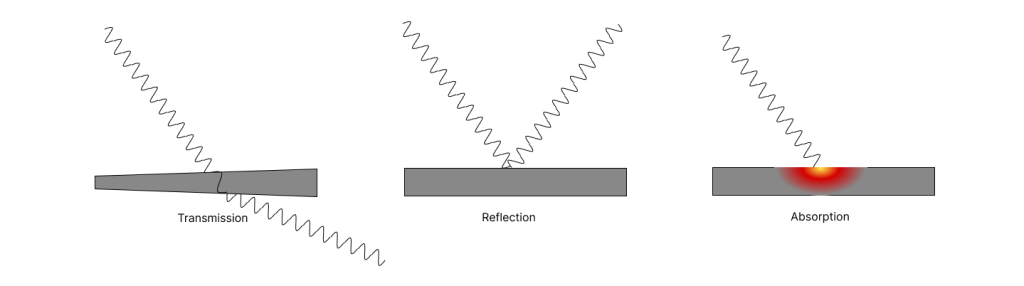
Light is a form of electromagnetic radiation from a source often referred to as an emitter (like the sun). It consists of tiny packets of energy called photons, which travel in waves. These waves can vary in length and frequency, determining the characteristics of the light, such as its color and intensity. When light encounters a surface or material, it interacts in one or more of the following ways: transmission, reflection, or absorption. These interactions determine how we perceive objects and are fundamental to understanding lighting and color in visual media. It is how light interacts with surfaces that enables us to see the world around us. To understand more about light, let’s look at some properties of light.
Key Properties of Light
1. Wavelength:
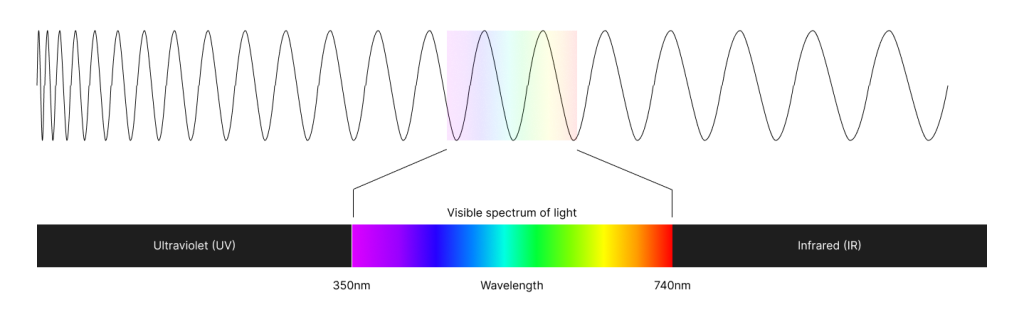
When we talk about a singe wave, we can make reference to one complete wave in the form of a sinus curve. The wavelength is the length from the beginning of the wave to the end of the wave. When a source continuously emits light, the light travels as a multiple of these waves (continuous) directionally outwards from the source in all directions. Light waves come in different lengths, measured in nanometers (nm).

Visible Light: The human eye can perceive only a certain spectrum of wavelengths, and is referred to as the visible spectrum of light. The visible spectrum of light , ranging from 350 nm (violet) to 740 nm (red). Different wavelengths correspond to different colors: Short wavelengths = cool colors (blue, violet). Long wavelengths = warm colors (red, orange).
2. Intensity
The intensity of light refers to the brightness of the light, determined by the number of photons. Higher intensity light appears brighter, while lower intensity light appears dimmer. The amplitude of the wave is in direct translation of the amplitude of the wave. The higher the amplitude, the higher the intensity.
3. Color Temperature
Color temperature refers to the warmth or coolness of light, measured in Kelvin (K). It describes the color appearance of a light source based on how it would appear if it were the light emitted by a heated object (like a metal rod being heated up).
- Warm light: Yellowish tones (~2000K–3000K).
- Cool light: Bluish tones (~6000K–10,000K).
4. Reflection, Refraction, and Absorption
- Reflection: Light bounces off surfaces.
- Transmission: Light bends when passing through mediums like glass or water.
- Absorption: Light is absorbed by objects, converting it into heat.
Now that we understand the properties of light, let’s look at how we perceive light.
Light and Human Perception
Being able to see is a true miracle. When light travels, certain wavelengths gets absorbed, and other gets reflected off of surfaces. When light gets reflected, the waves change direction. We “see” something when these waves hits our eyes. The human eye contains photoreceptor cells called rods and cones, which detect light:
- Rods: Sensitive to low light but do not perceive color.
- Cones: Detect color in bright conditions (red, green, and blue).
Light enables the perception of:
- Brightness (intensity or luminance).
- Color (hue, saturation, and tone).
Okay great, now let’s enter the digital platform. As a start, let’s look at a visual representation of the color spectrum, represented by a color wheel.
The color wheel
The color wheel gives us a visual representation of all the colors in the visual spectrum.
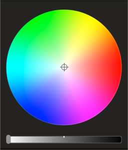
Looking at this color wheel, there are three concepts we need to understand. The first concept is “Hue“. Moving around the color wheel (radially), we’ll be changing the hue. Hue represents the color. The second concept is “Saturation”. In the centre of the color wheel is 0% saturation, and the outer edge represents 100% saturation. Saturation represents how vibrant the hue is. Now let’s select a red hue with an approximate saturation of 50%.
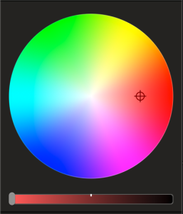
Now we can see the color we have selected represented with the color strip below the color wheel. Here I’ll introduce the third concept, called “Luminance“. The luminance is a digital representation of the intensity of light. By moving the slider to the far right would be a luminance of 0%. This is black for any hue. Next, let’s move the luminance to approximately 30%.
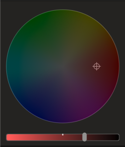
By changing the luminance, we can see that our selected color becomes “darker”. Now that we have a representation of visible light in a digital format, we need to understand how light works in digital media.
How do we see digital light?
What we see on a screen is an array of super small light emitters. There are several forms, but most commonly what you are looking at is an array of LEDs. An LED is a Light-Emitting Diode. There are only three colors of LED; red, green and blue. Yup – ever heard of RGB? It stands for Red, Green and Blue and is directly related to the fact that there are only three colors of LEDs. But wait Gideon! Now I’m confused! How do I then see other colors on my screen?
Before I explain this, let me throw in another curve-ball and talk about paint. Have you ever worked with paint? If you have, you’ll know that you can virtually make any color by mixing yellow, blue and red (Note the difference – not red, green and blue). For instance – if you mix yellow and blue – you’ll get green. Mixing various ratios of these, you’ll get different “hues” of green. Just FYI – hue is not a concept when working paint. Industry has standardised this in printers, where you can do the same by mixing Cyan, Magenta, Yellow and Black. Ever heard of “CMYK”. Well now you know.
Digitally we have a bit more difficulty. See Light-Emitting Diode technology is quite complex, and in a point in history it was believed that the blue LED would never be able to be created. It was only mastered in 1972. This followed the invention of the green LED in 1958 and red LED in 1962. It was only when we have all three LED colors were discovered that the digital platform boomed. Like paint, we can create almost all the hues, saturations, and luminance of the visual spectrum.
Today, these LEDs can be so small, they are almost impossible to see with the eye. Assuming you’ve heard of pixels, on pixel on your monitor contains 3 LEDs, one of each color. By changing the luminance of each LED in this pixel, we can create all of these beautiful colors that we see on our monitors/screens. This means that if your screen is 1920×1080 (HD), is has more than 6 million LEDs.
Light in Digital Media
In digital imaging, light is simulated using mathematical models. These mathematical models determines the outputs to each individual LED on a digital screen, together rendering the image we see. By using software like DaVinci Resolve we can manipulate the brightness, contrast, and color to emulate the properties of real-world light.
What is important to understand is that each manufacturer uses their own unique mathematical model, designed specifically to what their opinion of “perfect” is. This is why we experience images looking different from screen to screen, camera to camera. But generally speaking, what looks good one one platform, should look good on another platform as well.
Now, we need a basic understanding of how camera sensors work to understand the tools that software like Deviance Resolve offers.
How light capturing sensors work
So we know that light travels in the form of electromagnetic waves. Some smart-ass people out there discovered a way of capturing light with its properties. How? Well if you’re interested, I’ll give you the details below.
Light travels through the lens to the camera sensor
When trying to understand how sensors work, we need to clearly understand the concept of reflection and absorption of light. Any surface has the ability to absorb some wavelengths of light (let through) and the ability to reflect light. We can see surfaces reflecting light as surfaces “rejecting” a certain wavelength. When we see a surface as green, it basically absorbs most of the wavelengths of the visible colour spectrum except that of green light (refer to the basics of light an colour). When reflected, the reflected “green” wavelengths waves hits our eyes and our brains transform that into what we perceive as green. Remember that these waves are waves of photons? Photons carry energy and can be captured.
When light travels in the form of electromagnetic waves (photons – energy), light from emitters and reflected from surfaces will enter into our camera lens. The lens’s purpose is to focus these waves to a sensor behind the lens. A camera sensor is usually a CMOS (Complimentary Metal-Oxide Semiconductor) or CCD (Charge Coupled Device) chip.
1. Capturing the Image data (Sensor Data)
A camera sensor is designed to capture this light and convert it into an image using its internal structure and technology. A camera sensor is usually a CMOS or CCD chip made up of millions of tiny photosites (pixels). Each photosite captures photons and converts them into an electrical signal. The amount of light hitting each photosite determines the intensity of the signal, corresponding to the brightness of that pixel. One photosite consists of 4 photodiodes.
Cameras can’t “see” color directly because each photosite only measures the intensity of light. To capture color, the sensor uses a color filter array (CFA), with the most common being the Bayer filter mosaic.
The Bayer Filter Mosaic
Each photodiode is covered by a tiny colored filter that allows only one color of light to pass through: red, green, or blue. These correspond to the primary colors of light.
The Bayer pattern consists of:
2x Green Photodiodes
1x Red Photodiode
1x Blue Photodiode
*For reference, the color does not refer to the color of the photodiode, but rather the color of the filter covering it.
The arrangement has twice as many green filters because the human eye is most sensitive to green light. This ensures the sensor captures more detail and reduces noise. An enlarged representation of a piece of a CMOS sensor under a microscope can be seen below. To put it into perspective, one photodiode is about 0.001mm in width.
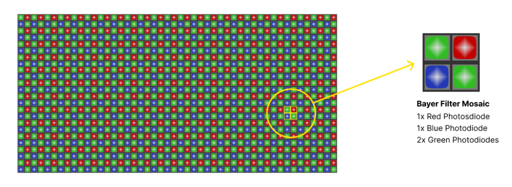
Through the complex work of a photosite, a process will occur which we call Demosaicing. This is where the raw data from the sensor is processed using an algorithm (called demosaicing), which combines the red, green, and blue values from neighboring pixels to reconstruct the full-color image.
The captured energy is transformed to signals (raw data). The light intensity is captured as an analog signal, which corresponds to the color and brightness of the light hitting each pixel.
2. Image Processing (Pre-Codec Processing)
After the raw sensor data is digitized, the camera often applies several internal processing steps to enhance the image and prepare it for compression. These steps can include:
Noise Reduction: Cameras often apply noise reduction algorithms to remove digital noise from the image (especially in low-light conditions).
White Balance: The camera adjusts the color balance to ensure that colors appear natural, removing any color casts caused by different light sources.
Gamma Correction: This adjusts the brightness and contrast of the image to better match how the human eye perceives light.
Color Space Conversion: The raw sensor data might be in a color space like RGB or YCbCr (YUV), and may be converted to a standard color space for final output, like Rec. 709 for HD video or DCI-P3 for digital cinema.
Compression Preparation: In some cases, cameras prepare the data by subsampling (reducing the resolution of certain color channels to save data), especially in formats like YUV.
3. Encoding (Compression)
Once the image is processed and ready, the data is passed to a codec for compression. A codec (short for compressor-decompressor) is a software or hardware tool that compresses (reduces the size of) and decompresses (restores the original data) audio or video files. It encodes the data for storage or transmission and then decodes it for playback or editing. Codecs use various algorithms to balance file size and quality, making them essential for efficient video and audio streaming, recording, and editing. Compression can be lossy (reducing file size with some loss of quality) or lossless (preserving all quality, but with larger file sizes). Here’s how the codec processes the image:
Encoding: The codec applies mathematical algorithms to compress the data, reducing the file size by removing redundancies and less important visual information.
- In lossy compression, the codec might discard some of the visual data that the human eye is less likely to notice (like subtle color variations or details in dark areas).
- In lossless compression, the codec preserves all the original image data, but still applies algorithms to reduce size without sacrificing quality.
Bitrate Control: The codec may use a set bitrate to determine how much data is used to encode each frame, affecting the balance between file size and video quality.
Encoding Standard: Popular codecs like H.264, HEVC (H.265), or ProRes each use different compression techniques:
- H.264/HEVC: These are lossy, highly efficient video codecs used for streaming and distribution. They focus on compressing temporal redundancies between frames.
- ProRes: A high-quality intermediate codec used for post-production. It retains more detail but with a higher bitrate and larger file size.
4. Output: Final File Format
After compression, the encoded video is stored in a container format (also known as a wrapper), which holds both the video and audio streams along with metadata. Common container formats include:
- MP4: Often used with H.264 or HEVC codecs.
- MOV: Common for ProRes and other high-quality formats.
- MKV: Supports multiple audio and video codecs, used for high-quality video storage.
Key concepts of digital image quality
1. Bitrate
Definition:
- Bitrate refers to the amount of data processed per unit of time in a video or audio file. It’s usually measured in kilobits per second (kbps) or megabits per second (Mbps) for video.
Impact on Quality:
- Higher bitrate = Better quality: A higher bitrate allows more data to be used to represent the video or audio, leading to less compression and therefore better quality.
- Lower bitrate = More compression: Lower bitrates result in more aggressive compression, which reduces file size but can also degrade the quality of the video (blurring, pixelation, artifacting).
How Bitrate Ties with Codecs:
- Codecs determine how video and audio data is compressed. Different codecs (H.264, HEVC, ProRes) use different methods of compression. While a higher bitrate typically results in better quality, the choice of codec affects how efficiently data can be compressed without visible quality loss.
2. Bit Depth
Definition:
- Bit depth refers to the amount of data used to represent the color of a single pixel in a video or image. It defines how many colors or shades of gray can be displayed.
Impact on Quality:
- Higher bit depth = More color information: With higher bit depth, there are more color variations, allowing for smoother color gradients and more detail in shadows and highlights.
- For example, a 8-bit image can represent 256 shades per color channel, while a 10-bit image can represent 1024 shades per channel.
- Lower bit depth = Less color information: With lower bit depth, color gradients may appear banded (visible steps between colors), and there may be a loss of detail in darker or lighter areas.
How Bit Depth Ties with Codecs:
- Different codecs support different bit depths. For example:
- H.264 usually works with 8-bit color depth.
- ProRes and HEVC (H.265) can support 10-bit and even higher bit depths, which allows for finer color grading in post-production.
3. Dynamic Range
Definition:
- Dynamic range refers to the difference between the lightest and darkest parts of an image or video. It defines how much detail can be captured in both the shadows (dark areas) and highlights (bright areas).
Impact on Quality:
- Higher dynamic range means greater detail in both dark and bright areas, which is crucial for cinematic images. This is especially important for scenes with both bright and dark elements, like sunrises or indoor shots with windows.
- Lower dynamic range can lead to loss of details in shadows (which might become black) or highlights (which might become pure white).
How Dynamic Range Ties with Codecs:
- Codecs with higher dynamic range support (such as ProRes or HEVC) can preserve more detail in both the dark and bright parts of the image. This is especially important when working with footage from high dynamic range (HDR) cameras.
- HDR video typically requires codecs and bit depths that can handle more information, like 10-bit color depth and higher dynamic range (e.g., 1000 nits or more).
How These Concepts Work Together
These three concepts—bitrate, bit depth, and dynamic range—are all part of how video quality is determined and encoded.
- Bitrate affects how much data is used to store the video, influencing its quality and file size.
- Bit depth defines the color precision and smoothness of gradients, with higher bit depths providing better color fidelity.
- Dynamic range defines the contrast between the brightest and darkest areas of the image, affecting how much detail is preserved in extreme lighting conditions.
When you choose a codec to compress your video, the codec will handle how these elements are encoded:
- Compression Efficiency: Codecs like HEVC are more efficient at compressing video while preserving detail than older codecs like H.264.
- File Size vs. Quality: A codec may allow you to choose between a higher bitrate (better quality) or a lower bitrate (smaller file size), but this will affect the bit depth and dynamic range based on what the codec supports.
Examples of How Codecs Use These Properties:
- H.264: Uses 8-bit color depth and is widely used for streaming and distribution due to its efficient compression. It is not ideal for high-dynamic-range footage or deep color grading.
- HEVC (H.265): Supports 10-bit color depth and higher dynamic range, making it a great choice for high-quality video (4K, HDR) with more efficient compression than H.264.
- ProRes: Known for its higher quality due to lower compression. It supports higher bit depths (up to 12-bit) and preserves greater dynamic range, which is essential for professional post-production workflows, especially in HDR.
Chapter 2
Davinci Resolve | Color grading tab layout
FINALLY!
Now that you understand how light, digital processing and codecs work, we can finally get into color grading.
I’ll start off by covering the basic tools provided in Davince Resolve. Color grading is done in the Color Grading tab of Davince Resolve. Let’s have a look at the layout of the colour grading tab:
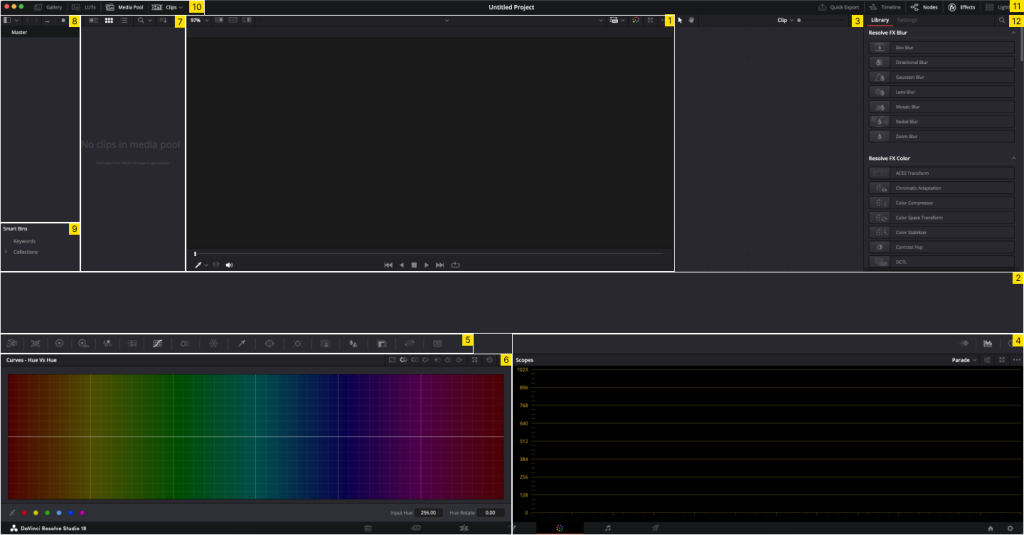
Referring to the numbers in the top right corner of each section in the image above, we get the following;
- Preview window – For previewing the selected clip
- Clips window – For selection of the active clip
- Node window – This is the node tree of your colour grade (where the colour grade is built)
- Scopes window – This gives you colour, luminance, hue, etc. data about the active clip
- Grading tool selection tab – This is where we select the tool which we want to utilise in a node in the node tree (3). Don’t worry if this does not make sense for now.
- Selected grading tool editor window – The editor of the selected grading tool (5)
- Media pool, gallery or LUTs window (based on active selection in 10)
- Project library window
- Smart bin window
- Window selection tab – to select the active windows in the layout
- Tools tab – Here se can activate additional windows and tools
- Inspector window – effects library and inspector window of effects
I’ll make reference to the above through the course of this material.
Fundamentals
Reading scopes
What Are Scopes in Color Correction?
Scopes (refer to scopes window (4) of the color grading tab layout) are essential tools used in video editing and color grading to analyze the visual information in a clip. They help measure exposure, color balance, and chroma levels to ensure that your footage adheres to technical and creative standards. Unlike the human eye, scopes provide objective data about an image, making them invaluable for consistent and accurate color correction.
Types of Scopes and How They Work
1. Waveform Monitor
Purpose: Measures luminance (brightness) or chrominance (color intensity) across the frame.
- How It Works:
- The X-axis represents the horizontal layout of the image (left to right).
- The Y-axis shows brightness levels, ranging from 0 (black) at the bottom to 100 IRE (pure white) at the top. IRE is the standard set out by the “Institute of Radio Engineers”.
- How to Read It:
- Dark areas appear as low points on the graph, while bright areas are high points.
- Aim to keep details within the 0–100 IRE range to prevent crushed blacks (where we lose details in the shadows) or blown-out highlights (where we loose details in the whites).
Referring to the waveform below, we can see that the exposure of the frame falls within the 0-100 IRE (scale on the left measured from 0 to 1023 for 10-bit footage). We can see that in the middle of the frame we are touching 0 IRE meaning we will loose some detail in the shadows, and also 100IRE when we will lose some detail in the highlights.

When we utilise the full IRE spectrum, it will mean we have a good contrast. If the waveform reads between 384 and 640 for the extremes, we’ll have a low contracts and the image will look washed out.

2. RGB Parade
- Purpose: Displays the luminance and chroma for the red, green, and blue channels separately.
- How It Works:
- Each color channel is displayed as a separate graph, aligned horizontally.
- Like the waveform, the Y-axis represents brightness.
- How to Read It:
- A balanced image will show similar levels across all three channels.
- A color cast appears as one channel significantly higher or lower than others (e.g., too much red)
Referring to the parade below, we can see that the red channel is generally higher than the blue channel. Thus we can expect the image to be fairly warm.

Now let’s add blues to the lift, gamma and gain. By looking at the parades, we can expect that the image will now be cooler (more blue). Since both red and blue are now high, we’ll see a hint of magenta.

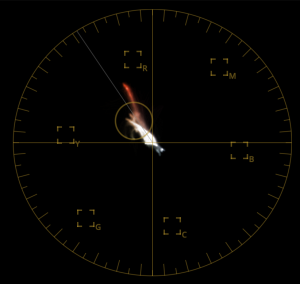
3. Vectorscope
- Purpose: Measures chrominance (color information) in terms of hue and saturation.
- How It Works:
- The graph is circular, with hues (red, green, blue, cyan, magenta, yellow) represented around the circle.
- Saturation is measured by the distance from the center (center = no saturation).
- How to Read It:
- Skin tones should align along the “skin tone line” (near the red/yellow area).
- Oversaturated colors will appear farther from the center, while desaturated colors cluster near the center.
4. Histogram
- Purpose: Shows the distribution of brightness levels (luminance) across the image.
- How It Works:
- The X-axis represents brightness levels (shadows, midtones, highlights).
- The Y-axis shows the number of pixels at each brightness level.
- How to Read It:
- A balanced image will have a spread across the histogram without excessive clipping on either end.
- Clustering to the left = underexposed. Clustering to the right = overexposed.
Referring to the image below, we can see the crushing of the blue channel. Similar to the waveform, we can see that the red and green channels are higher than that of blue, thus we can expect a warm image.

Now let’s again add blues to the lift, gamma and gain. By looking at the histogram, we can expect that the image will now again be cooler (more blue). We can also see that we are overexposing the blue channel by the clustering on the right.

Nodes
Let’s have a look at the Node Window (3). Davinci Resolve’s colour grading is a node based setup. This can be very challenging to understand at first, but you’ll get the hang of it as time goes on. For the basic understanding, let’s look at a simple three node structure in serial as seen below.

From left to right, we’re starting with the input node (grey block with circle in it) representing the clip, then we have three nodes in serial (nodes connected in a serial manner), ending with an output node (grey block with circle in it) representing the final grade.
Except for the input and output (grey blocks with circle in it) , each node has an input and output itself (green triangle and green square consecutively). When considering any node, it takes the input, modifies it with the tools within a node, and gives an output. The output of node 1 above (named Step 1) is routed to the input of node 2 (named Step 2). This means that node 2 (Step 2) will use the result of node 1, and any adjustments made in node 2 will be made using the results (output) of node 1 (Step 1).
What can also be seen above is that each serial node has a blue input and output as well (blue triangle and green square consecutively). These are for masks, which we’ll cover at a later stage.
Now let’s look at the main types of node structures and their uses. Nodes can be added using shortcuts or via the “Color” tab in main menu bar.
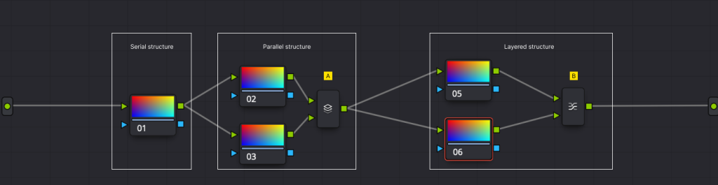
The serial node structure:
A serial node takes an input, modifies the input with the tool applied within the node, and return an output.
The parallel node structure:
Parallel nodes takes the same input, modifies the input with the tools applied in each node, and returns a combined output. The combined output multiplies the results together as one output. this can be seen with the parallel mixer after the parallel nodes (Point A). Multiple nodes can be used in a parallel node structure.
The layered node structure:
The layered node structure takes the same input, modifies the input with the tools applied in each node, and returns a layered output. The output of the top node will be layered on top of the output of the node below it. The outputs with their layering position gets layered to one output with the layer mixer (Point B). With a layer mixer, the composite mode can be changed (Normal, screen, hard light, soft light, difference, etc). Multiple nodes can be used in a layered node structure.
With these node structures, let get into the tools used to modify the inputs of each node. When a node is selected, we can change inputs with tools from the colour grading tool selection tab (5) and the corresponding selected grading tool editor window (6). Additionally to this, we can add effects as found in the Tools tab (11) and corresponding inspector window (12).
Tools explained
Camera Raw
What is the Camera RAW Tab in DaVinci Resolve?
The Camera RAW Tab in DaVinci Resolve is a dedicated section within the Color page that allows you to adjust and manipulate the raw data captured by cameras that shoot in RAW formats, such as Blackmagic RAW (BRAW), REDCODE RAW (R3D), ARRI RAW, and others. RAW footage retains the maximum amount of image data, providing flexibility to adjust settings like exposure, white balance, and ISO, all without degrading image quality.
The Camera RAW Tab acts as a virtual extension of your camera, letting you modify key settings after filming while keeping the integrity of the raw data.
Key Features of the Camera RAW Tab
Decode Using:
- Choose how Resolve interprets the RAW footage.
- Camera Metadata: Uses the settings recorded in-camera.
- Project Settings: Applies global settings defined in the project.
- Clip: Allows individual customization for each clip.
- Choose how Resolve interprets the RAW footage.
White Balance:
- Adjust temperature (cool to warm) and tint (green to magenta) to correct the color balance of your footage.
ISO:
- Change the sensitivity of the sensor post-capture, affecting exposure. Lower ISO settings reduce noise, while higher settings can brighten the image.
Exposure:
- Fine-tune the overall brightness of your image without affecting highlights or shadows disproportionately.
Contrast:
- Adjust the difference between dark and light areas to refine tonal balance.
Highlight Recovery:
- Restore details in overexposed areas of the image if the RAW data contains recoverable information.
Saturation:
- Adjust the intensity of colors across the entire image.
Sharpness:
- Fine-tune the perceived sharpness of your image. (Typically best left at default for RAW workflows.)
Color Space and Gamma:
- Define the color space (e.g., Rec. 709, Blackmagic Design Film) and gamma curve (e.g., Log, Linear) used to interpret the footage.
Clip Decoder Settings:
- Advanced controls specific to the RAW format, such as compression ratios or black levels.
How to Use the Camera RAW Tab
Access the Tab:
- Go to the Color Page.
- Open the Camera RAW Tab from the toolbar (usually a camera icon).
Select “Decode Using”:
- If you want to adjust the RAW settings manually, select Clip. Otherwise, use Camera Metadata or Project Settings for automatic adjustments.
Adjust Basic Settings:
- White Balance: Start by setting the correct temperature and tint.
- ISO: Use this to fine-tune exposure without adding noise.
- Exposure: Correct overall brightness if necessary.
Refine Image Details:
- Use Highlight Recovery to regain details in overexposed areas.
- Adjust Contrast and Saturation for the desired look.
Set Color Space and Gamma:
- Choose a log profile for maximum flexibility in grading or Rec. 709 for a broadcast-ready look.
Match Clips:
- Use these settings across multiple clips for consistency. You can copy and paste settings or use Resolve’s Match Clips feature.
Best Practices
- Start Here: Always adjust Camera RAW settings first before moving to primary color correction or grading.
- Non-Destructive Workflow: These changes don’t alter the original footage; they’re metadata adjustments.
- Monitor Scopes: Use Resolve’s scopes to ensure accurate adjustments, especially for exposure and color balance.
The Camera RAW Tab is a powerful tool that ensures you extract the highest quality and flexibility from your RAW footage.
Color Match
What is the Color Match Tool in DaVinci Resolve?
The Color Match Tool in DaVinci Resolve is a feature designed to automatically adjust the color and exposure of your footage based on a reference color chart. It ensures accurate color reproduction, helping you achieve a neutral starting point for further grading. This tool is especially useful when working with footage from multiple cameras, as it helps standardize colors across clips.
How the Color Match Tool Works
The Color Match Tool works by analyzing the color swatches on a reference chart (like the X-Rite ColorChecker), comparing the recorded values to the known target values of the chart, and adjusting your clip to align with the chart’s color and luminance information.
How to Use the Color Match Tool
Prepare Your Footage:
- Ensure you’ve filmed a color chart in the same lighting conditions as your subject.
- The chart should be clearly visible and well-lit in the frame.
Go to the Color Page:
- Open your footage in the Color Page in DaVinci Resolve.
Enable Color Match:
- Click on the Color Match icon (a chart symbol) located at the top of the interface.
Set Color Chart and Settings:
- Select Chart Type: Choose the chart you used during filming (e.g., X-Rite ColorChecker).
- Set Source Gamma: Match the camera profile or gamma curve you used (e.g., Blackmagic Film, Rec. 709).
- Set Target Gamma: Choose the desired output gamma (e.g., Rec. 709 for broadcast).
Align the Grid:
- Place the grid overlay onto the corresponding swatches of the color chart in your footage. Ensure it aligns accurately with the chart.
Click Match:
- Press the Match button, and DaVinci Resolve will adjust the clip’s color and exposure automatically.
Best Practices for Using the Color Match Tool
Capture the Chart Correctly:
- Ensure the color chart is parallel to the camera and occupies a significant portion of the frame.
- Avoid shadows, reflections, or uneven lighting on the chart.
Use Scopes:
- After applying Color Match, use scopes (e.g., waveform, vectorscope) to verify the correction. This ensures that the result aligns with your creative goals.
Fine-Tune After Matching:
- The Color Match Tool provides a great starting point, but you may still need to adjust contrast, saturation, or other parameters to suit your final look.
Match Multiple Clips:
- If you’re working with several clips, match one clip and copy the settings to others, or ensure each clip uses the same chart.
Limitations
- Works best with high-quality, well-lit footage.
- The effectiveness depends on proper alignment and the chart being clearly visible.
Primaries
What Are the Primaries Tools in DaVinci Resolve?
The Primaries Tools in DaVinci Resolve are advanced controls that allow you to make precise adjustments to the image’s brightness, color, and contrast across specific tonal ranges (shadows, midtones, highlights) or the entire image. These tools include Color Wheels, Primary Bars, and Log Wheels, each serving different purposes for color correction and grading.
Components of the Primaries Tools
Color Wheels:
- Adjust Lift, Gamma, Gain, and Offset using circular controls to manipulate luminance and color balance for specific tonal ranges:
- Lift: Shadows/dark areas.
- Gamma: Midtones.
- Gain: Highlights/bright areas.
- Offset: The entire tonal range.
- Adjust Lift, Gamma, Gain, and Offset using circular controls to manipulate luminance and color balance for specific tonal ranges:
Primary Bars:
- Vertical sliders adjacent to the Color Wheels for fine control of:
- Y: Luminance (brightness).
- R, G, B: Individual Red, Green, and Blue channel adjustments.
- Contrast: Adjusts the difference between dark and light areas.
- Saturation: Controls the intensity of colors.
- Hue: Shifts overall color tones.
- Vertical sliders adjacent to the Color Wheels for fine control of:
Log Wheels:
- Similar to Color Wheels but tailored for more specific control:
- Shadows: Targets only the darkest areas of the image.
- Midtones: Adjusts a narrower range of midtones compared to Gamma.
- Highlights: Focuses on the brightest areas.
- Similar to Color Wheels but tailored for more specific control:
Offset Control:
- Affects the entire tonal range, useful for making significant overall adjustments to brightness and color.
How to Use the Primaries Tools
Step 1: Adjust Exposure
- Use the Lift to ensure shadows are rich but not crushed (blacked out).
- Adjust Gamma for natural brightness in midtones without washing out the image.
- Modify Gain to ensure highlights are bright without clipping.
- Use the Offset control sparingly for broad adjustments to brightness or color.
Step 2: Correct Color Balance
- Shift the wheels for Lift, Gamma, and Gain to remove color casts:
- Example: If shadows are too blue, move the Lift wheel toward orange to neutralize the cast.
- Use scopes (e.g., RGB Parade) to ensure balanced color across tonal ranges.
Step 3: Adjust Contrast
- Use the Contrast slider in the Primary Bars to create more depth in your image.
- Modify the Pivot control to adjust the balance of where contrast changes occur.
Step 4: Refine Colors
- Use the Saturation slider to adjust color intensity. Avoid oversaturating to maintain a natural look.
- Adjust Hue to fine-tune the overall color tone or correct minor color casts.
Step 5: Fine-Tune with Log Wheels
Use Shadows, Midtones, and Highlights wheels for precise adjustments:
- Shadows: Dark areas only, without affecting midtones or highlights.
- Midtones: A narrower range than Gamma, ideal for skin tones or fine details.
- Highlights: Bright areas only, like skies or reflective surfaces.
Use these controls for more targeted corrections compared to Color Wheels.
Practical Applications of the Primaries Tools
Balancing Footage:
- Use the Lift, Gamma, and Gain wheels to balance brightness and color across clips for a consistent look.
Removing Color Casts:
- Identify imbalances in shadows, midtones, or highlights using scopes and adjust the respective wheel.
Cinematic Looks:
- Add warmth to highlights with the Gain wheel and cool tones to shadows with the Lift wheel for a “teal and orange” look.
Protecting Skin Tones:
- Use the Log Wheels to adjust midtones carefully, ensuring skin tones remain natural.
Creative Grading:
- Use the Offset wheel to apply broad color tones across the entire image or make bold artistic adjustments.
Tips for Using Primaries Tools
Work in Order:
- Start with Lift, Gamma, and Gain adjustments, then refine with Log Wheels and Primary Bars.
Monitor Scopes:
- Use the Waveform to track luminance levels and the RGB Parade to ensure color balance.
Use Small Adjustments:
- Subtle changes yield better results and prevent overshooting, especially with color balance and contrast.
Experiment with Log Wheels:
- They allow for fine-tuned control in specific areas and can rescue details in problem areas without affecting the rest of the image.
Save Presets:
- If you find a combination of settings that works well, save it as a preset for consistent results across similar footage.
Comparison of Primaries Tools
| Tool | Tonal Range | Use Case | Precision Level |
|---|---|---|---|
| Color Wheels | Shadows, Midtones, Highlights, Overall | Broad adjustments for exposure and color balance | Medium |
| Primary Bars | Individual Channels (Y, R, G, B) | Precise adjustments for luminance and individual channels | High |
| Log Wheels | Shadows, Midtones, Highlights | Targeted adjustments for specific tonal regions | Very High |
High Dynamic Range (HDR)
What Are the HDR Tools in DaVinci Resolve?
The HDR Tools in DaVinci Resolve are advanced grading controls designed for High Dynamic Range (HDR) workflows. These tools allow you to manipulate specific tonal zones across a broader dynamic range than the traditional color grading tools. They are ideal for fine-tuning highlights, shadows, and midtones in HDR projects but are also effective for Standard Dynamic Range (SDR) workflows.
Unlike the standard Color Wheels, the HDR Tools break the tonal range into multiple zones, giving you more precise control over specific parts of the image.
Components of the HDR Tools
Zones:
- The image is divided into several zones, each representing a specific luminance range:
- Black: Deep shadows.
- Shadow: Dark tones above pure black.
- Light: Midtones leaning toward highlights.
- Specular: Extreme highlights.
- These zones can be customized to suit your footage.
- The image is divided into several zones, each representing a specific luminance range:
HDR Wheels:
- Each zone has its own wheel for adjusting luminance, contrast, and color balance.
- Luminance (Y): Adjusts brightness for the specific zone.
- Color (RGB): Shifts the color balance within that zone.
Zone Controls:
- Exposure Slider: Adjusts brightness for the entire zone.
- Contrast Slider: Controls the tonal contrast within the zone.
Softness Controls:
- Adjust the transitions between adjacent zones to create smoother or sharper gradients.
Global Settings:
- HDR Master Settings: Define the overall range and tone mapping for HDR grading.
- Range Presets: Adjust HDR grading for specific standards (e.g., Dolby Vision, HDR10).
How to Use the HDR Tools
Step 1: Setup and Identify Zones
- Open the HDR palette from the Color Page toolbar.
- Use the default zones or customize them:
- Adjust Zone Points: Define where each tonal zone starts and ends using the sliders in the Zone settings.
Step 2: Adjust Luminance
- Start with the Black and Shadow zones to ensure the darkest parts of the image are rich and detailed.
- Adjust the Light zone to enhance midtones and create natural brightness.
- Use the Specular zone to refine bright highlights, such as reflective surfaces or light sources.
Step 3: Correct Color Balance
- Adjust the Color Wheels for each zone:
- Neutralize color casts by shifting the wheel in the opposite direction of the cast.
- Add creative tones, such as cooler shadows (blue) or warmer highlights (orange), for artistic looks.
Step 4: Refine Zone Transitions
- Use the Softness sliders to adjust how smoothly each zone transitions into the next:
- Increase softness for gradual transitions.
- Decrease softness for sharper separation between zones.
Step 5: Fine-Tune Contrast
- Adjust the Contrast sliders within each zone to enhance tonal depth:
- Increase contrast in shadows for punchy dark areas.
- Lower contrast in highlights for a softer look.
Step 6: Match HDR Standards
- Use the HDR Master Settings to ensure your footage meets HDR delivery specifications:
- Adjust tone mapping for the target output (e.g., HDR10, Rec. 2020).
Practical Applications of HDR Tools
Recovering Highlight Details:
- Use the Specular zone to retrieve detail in overexposed areas while preserving brightness.
Enhancing Depth:
- Increase contrast in shadows and highlights to make the image appear more three-dimensional.
Refining Skin Tones:
- Use the Light zone to adjust midtones, ensuring skin tones remain natural and balanced.
Creating Cinematic Looks:
- Cool down shadows using the Shadow zone while warming highlights in the Specular zone for a cinematic grade.
HDR to SDR Conversion:
- Use the HDR Master Settings to remap tones for delivery in SDR formats.
Tips for Using HDR Tools
Start with Zone Defaults:
- Default zones often work well, but customize them if needed for specific footage.
Use Scopes:
- Monitor your adjustments with scopes like the Waveform or Histogram to ensure the tonal range stays within HDR standards.
Work Iteratively:
- Start with broad adjustments across zones, then refine with the individual sliders.
Check for HDR Compliance:
- Verify your work using HDR monitoring tools to ensure proper color and luminance levels.
Layer HDR Adjustments:
- Combine HDR tools with other grading tools like Curves and Qualifiers for advanced results.
Comparison: HDR Tools vs. Standard Color Wheels
| Feature | HDR Tools | Standard Color Wheels |
|---|---|---|
| Tonal Control | Divided into multiple customizable zones | Divided into Lift, Gamma, Gain |
| Dynamic Range | Optimized for HDR workflows | Limited to SDR or standard ranges |
| Transition Control | Softness adjustment between zones | No control over tonal transitions |
| Precision | High | Medium |
RGB Mixer
What is the RGB Mixer in DaVinci Resolve?
The RGB Mixer is a powerful tool in DaVinci Resolve that allows you to manipulate the Red, Green, and Blue color channels of your footage. It provides precise control over how each color channel contributes to the overall image, enabling advanced color correction, creative looks, and specific effects like black-and-white grading.
How the RGB Mixer Works
Color Channels:
- Footage is composed of three primary color channels: Red, Green, and Blue.
- Each channel’s contribution to the final image can be adjusted using the RGB Mixer.
Source Channels:
- Each output channel (Red, Green, Blue) can be composed of a custom mix of the three input channels. For instance:
- Adjust the Red Output by modifying the contributions of Red, Green, and Blue source channels.
- Similarly, modify the Green and Blue outputs.
- Each output channel (Red, Green, Blue) can be composed of a custom mix of the three input channels. For instance:
Monochrome Mode:
- When enabled, this mode converts the image to black-and-white by controlling how the three channels contribute to luminance.
Reset to Defaults:
- Default values for each channel:
- Red Output = 100% Red, 0% Green, 0% Blue
- Green Output = 0% Red, 100% Green, 0% Blue
- Blue Output = 0% Red, 0% Green, 100% Blue
- Default values for each channel:
How to Use the RGB Mixer
Step 1: Access the RGB Mixer
- Navigate to the Color Page.
- Open the RGB Mixer tab from the toolbar.
Step 2: Adjust Channel Outputs
- Select a color channel to modify (Red, Green, or Blue Output).
- Adjust the sliders for the input channels (Red, Green, Blue) to alter how each channel contributes to the final image.
Step 3: Correct Color Imbalances
- Use scopes like the RGB Parade to identify channel imbalances.
- Adjust the sliders in the RGB Mixer to balance the channels:
- Reduce excessive Red in highlights by lowering the Red input slider for the Red Output.
- Add more Blue to shadows by increasing the Blue input slider for the Blue Output.
Step 4: Create a Black-and-White Image
- Enable Monochrome Mode in the RGB Mixer.
- Adjust the Red, Green, and Blue sliders to control the luminance contribution of each channel:
- Increase Red for brighter skin tones.
- Adjust Green for balanced midtones.
- Reduce Blue to darken skies or water.
Step 5: Apply Creative Color Effects
- Shift color tones by manipulating the input channels:
- Create a “cool” tone by increasing Blue in the Red and Green Outputs.
- Simulate vintage film looks by mixing high Green and low Blue in all outputs.
Step 6: Isolate Specific Colors
- Emphasize certain colors by decreasing their contribution in unrelated channels:
- For instance, to make Red tones pop, reduce Green and Blue contributions in the Red Output.
Practical Applications of the RGB Mixer
Fixing Channel-Specific Issues:
- Correct individual channel imbalances caused by improper white balance or lighting.
Creating Monochromatic Looks:
- Fine-tune black-and-white images by emphasizing specific channels.
Color Matching Across Clips:
- Adjust individual channels to match colors between footage shot on different cameras.
Artistic Effects:
- Alter channel mixes to create surreal or stylized looks.
Recovering Detail:
- Use the mixer to minimize blown-out highlights or crushed shadows by redistributing channel contributions.
Tips for Using the RGB Mixer
Monitor with Scopes:
- Use the RGB Parade to ensure adjustments are balanced across channels.
Work on a Node:
- Apply the RGB Mixer on a separate node to isolate changes and maintain flexibility.
Use Monochrome for Highlights:
- Monochrome mode can be particularly effective for black-and-white projects, offering more control than simple desaturation.
Experiment with Small Adjustments:
- Subtle changes in channel mixes often have the most natural and impactful results.
Preserve Skin Tones:
- Be cautious when altering the Red channel, as it significantly impacts skin tones.
Example Adjustments
| Effect | Red Output | Green Output | Blue Output |
|---|---|---|---|
| Neutral Correction | 100% Red | 100% Green | 100% Blue |
| High Contrast Black & White | 40% Red | 60% Green | 30% Blue |
| Vintage Look | 80% Red | 110% Green | 90% Blue |
| Cool Shadows | 100% Red | 80% Green | 120% Blue |
Comparison: RGB Mixer vs. Color Wheels
| Feature | RGB Mixer | Color Wheels |
|---|---|---|
| Control | Channel-specific adjustments | Tonal range adjustments |
| Creative Effects | Allows channel blending for unique looks | Focused on tonal color balance |
| Precision | High (custom mix of channels) | Medium |
| Best Use Case | Channel imbalances, monochrome, creative effects | Exposure and color correction |
Motion Effects
What is the Motion Effects Tool in the Color Tab of DaVinci Resolve?
The Motion Effects Tool in the Color tab of DaVinci Resolve is designed to refine how motion is interpreted and processed during color grading. It includes features like Noise Reduction and Motion Blur to smooth out visual artifacts, reduce noise, and enhance motion clarity. These tools are especially useful for high-quality projects, such as films and commercials, where image precision is critical.
Key Features of the Motion Effects Tool
Noise Reduction:
- Reduces unwanted noise and grain in the footage.
- Operates on Temporal (motion-related) and Spatial (within a single frame) levels.
Motion Blur:
- Adds realistic blur to fast-moving objects, simulating the effect of a high shutter angle during filming.
Fine-Tuning Options:
- Controls for adjusting the balance between noise reduction strength, detail preservation, and motion smoothing.
GPU-Accelerated Processing:
- The tool uses GPU acceleration for efficient real-time processing, though the performance may depend on your system’s hardware.
How to Use the Motion Effects Tool
1. Accessing the Motion Effects Tool
- Navigate to the Color Page in DaVinci Resolve.
- Open the Motion Effects panel from the toolbar (it looks like a motion blur icon).
2. Noise Reduction
Enable Noise Reduction:
- Click the Temporal NR and/or Spatial NR toggles.
Adjust Temporal Noise Reduction:
- Frames: Select how many frames are analyzed for noise reduction (higher values provide smoother results but require more processing power).
- Motion Range: Define the level of motion analyzed (Small, Medium, Large) based on the complexity of your scene.
- Luma and Chroma Thresholds:
- Luma Threshold: Reduces brightness noise (grain in highlights or shadows).
- Chroma Threshold: Reduces color noise (color specks or patches).
Adjust Spatial Noise Reduction:
- Radius: Controls the size of the area analyzed for reducing noise within a single frame.
- Luma and Chroma Thresholds: Same as Temporal NR, but applied within the frame.
Tips for Noise Reduction:
- Start with Temporal NR for dynamic noise and use Spatial NR for static noise.
- Avoid over-reducing noise to prevent a plastic or overly smooth look.
3. Motion Blur
Enable Motion Blur:
- Toggle the Motion Blur feature.
Adjust Motion Blur Settings:
- Shutter Angle: Controls the amount of blur (e.g., 180° for natural motion, higher for dramatic effects).
- Motion Range: Similar to Temporal NR, determines the motion size considered.
Practical Applications:
- Smooth fast-moving objects in sports or action scenes.
- Enhance realism in footage shot with a low shutter angle.
4. Fine-Tuning with Blend Options
- Use the Blend slider to control the balance between the original and processed footage.
- Higher blend values retain more of the original footage’s details, while lower values emphasize the effects applied.
Practical Applications of Motion Effects
Reduce Noise in Low-Light Footage:
- Use Temporal NR to eliminate noise caused by high ISO settings in dark scenes.
Smooth Motion Artifacts:
- Apply Motion Blur to footage with jerky or strobing motion for a more cinematic feel.
Clean Up Visual Effects (VFX):
- Temporal and Spatial NR can clean up footage before compositing to ensure smoother results.
Prepare Footage for Streaming:
- Noise Reduction minimizes artifacts that might become more apparent when compressed for online platforms.
Tips for Using Motion Effects
Monitor Results on Scopes:
- Use Waveform or Vectorscope to ensure the adjustments don’t distort color or luminance levels.
Apply on a Node:
- Always use a separate node for motion effects to isolate changes and maintain flexibility.
Test on High-Motion Areas:
- Focus on sections with significant motion to fine-tune the Motion Blur settings effectively.
Combine with Qualifiers:
- For selective application, use a qualifier to target specific areas where motion effects are needed.
Check Playback Performance:
- Heavy Noise Reduction or Motion Blur may require rendering for smooth playback, especially on less powerful systems.
Curves
What Are Curves in DaVinci Resolve?
The Curves Tool in DaVinci Resolve is a versatile and powerful tool used for precise color and tonal adjustments. Unlike sliders or wheels, curves give you detailed control over specific aspects of your footage by allowing you to map input values (original brightness or color levels) to output values (adjusted levels). This makes it an essential tool for fine-tuning highlights, shadows, midtones, and specific colors.
Key Types of Curves in DaVinci Resolve
Custom Curves (Primary Curve):
- Adjust the luminance or color channels individually or together (Master, Red, Green, Blue).
Hue vs. Curves:
- Hue vs. Hue: Adjust specific hues in the image.
- Hue vs. Saturation: Control saturation levels for particular hues.
- Hue vs. Luminance: Adjust the brightness of specific hues.
Luminance vs. Curves:
- Luma vs. Saturation: Adjust saturation based on brightness levels.
- Saturation vs. Saturation: Refine saturation intensity across varying levels of existing saturation.
Customizable Secondary Curves:
- These allow further color refinement and are particularly useful for isolated corrections.
How to Use the Curves Tool
1. Accessing the Curves Tool
- Open the Color Page in DaVinci Resolve.
- Click the Curves Tool tab (icon of a graph line).
- Choose the type of curve you want to work with from the dropdown menu.
2. Adjusting the Custom Curves
Select a Channel:
- Choose Master for global changes or Red/Green/Blue to adjust individual color channels.
Add Control Points:
- Click on the curve line to create control points. Each point represents a specific tonal value (shadows, midtones, highlights).
Manipulate the Curve:
- Drag control points:
- Up: Brightens that tonal area or increases its intensity.
- Down: Darkens that tonal area or decreases its intensity.
- Drag control points:
Reset and Fine-Tune:
- Use the reset button to start over if adjustments go awry.
- For precise edits, adjust points numerically or via the Inspector.
3. Using Hue vs. Curves
Hue vs. Hue:
- Adjust how one hue shifts to another (e.g., change yellow tones to green for foliage).
Hue vs. Saturation:
- Increase or decrease saturation for specific colors, like boosting reds in skin tones or desaturating blues in skies.
Hue vs. Luminance:
- Brighten or darken specific hues without affecting others, useful for controlling highlights in skies or skin tones.
4. Working with Luminance and Saturation Curves
Luma vs. Saturation:
- Desaturate shadows while preserving color in highlights or vice versa.
- Great for balancing color intensity without impacting brightness.
Saturation vs. Saturation:
- Reduce or boost low-saturation areas without oversaturating already intense colors.
Practical Applications of Curves
Contrast Adjustment:
- Use a classic S-curve in the Master Curve to deepen shadows and brighten highlights for cinematic contrast.
Fixing Skin Tones:
- Use Hue vs. Hue to correct skin tones that look too green or red.
Targeted Color Pop:
- Use Hue vs. Saturation to make specific colors, like blue skies or green foliage, more vivid.
Highlight Recovery:
- Use the Luminance Curve to recover blown-out highlights or enhance midtones.
Creative Grading:
- Combine multiple curves (e.g., increase warm tones in highlights using Red Curve) for a stylized look.
Tips for Using Curves
Use Scopes for Precision:
- Monitor changes in the Waveform or Vectorscope to ensure accurate adjustments.
Isolate Adjustments:
- Use Power Windows and qualifiers to apply curves to specific areas of the image.
Be Subtle:
- Over-adjusting curves can introduce unnatural artifacts like banding or clipping.
Combine with Nodes:
- Apply curves in dedicated nodes to keep adjustments organized and reversible.
Leverage Presets:
- Start with curve presets (if available) and tweak them to suit your footage.
Comparison of Curves vs. Color Wheels
| Feature | Curves | Color Wheels |
|---|---|---|
| Precision | High (specific tonal or color targeting) | Medium (general tonal control) |
| Ease of Use | Moderate (requires a learning curve) | Easy (intuitive and fast adjustments) |
| Best Use Case | Fine-tuning highlights, shadows, and colors | Broad color balance adjustments |
Color Slice
What Is the Color Warper (Color Slice) in DaVinci Resolve?
The Color Warper (commonly referred to as Color Slice) is an advanced tool in DaVinci Resolve designed for highly precise color manipulation. It offers a grid-based interface that maps hue and saturation values, allowing you to isolate and adjust specific colors with unparalleled control. It is particularly useful for tasks like skin tone refinement, creating stylized looks, and fine-tuning color details.
Features of the Color Warper Tool
Hue-Saturation Grid:
- Displays a two-dimensional grid where hue is mapped along the horizontal axis and saturation along the vertical axis.
Control Points:
- The grid is divided into segments with control points representing specific color ranges. These can be dragged to adjust colors interactively.
Color Transformations:
- Allows direct manipulation of hue, saturation, and brightness for specific colors without affecting unrelated areas.
Flexible Interpolation:
- Changes blend smoothly across adjacent colors, ensuring natural transitions.
How to Use the Color Warper Tool
1. Accessing the Color Warper
- Open the Color Page in DaVinci Resolve.
- Click on the Color Warper icon in the toolbar (resembles a slice or grid).
2. Navigating the Grid
Understand the Grid:
- The center of the grid represents neutral or desaturated colors.
- The edges represent more saturated colors.
- The grid spans across hues from red through violet in a circular pattern.
Zoom and Pan:
- Use the scroll wheel to zoom in or out for detailed adjustments.
- Hold and drag the grid to pan across different sections.
3. Adjusting Colors
Selecting Points:
- Hover over the grid to highlight control points.
- Click and drag a point to adjust the associated color. For instance:
- Dragging upward increases saturation.
- Dragging sideways shifts the hue.
Multi-Point Adjustments:
- Select multiple points by dragging a box around them or holding Shift while clicking.
- Adjust all selected points simultaneously for larger-scale changes.
Reset Adjustments:
- Right-click on a point and select Reset to revert it to its original position.
4. Fine-Tuning with Additional Tools
Add or Remove Grid Lines:
- Use the grid density controls to increase or decrease the number of points for finer or broader adjustments.
Using Masks:
- Combine the Color Warper with Power Windows or qualifiers to restrict adjustments to specific regions (e.g., isolating skin tones).
Keyframe Changes:
- Create dynamic color transformations by keyframing adjustments over time.
Practical Applications of the Color Warper
Skin Tone Refinement:
- Smooth out uneven skin tones by slightly adjusting hue and saturation points for reds and oranges.
Selective Desaturation:
- Drag specific color points toward the center to desaturate them while leaving others intact.
Stylized Color Grading:
- Shift hues to create a cinematic look (e.g., teal and orange grading) by dragging blues and oranges to opposite ends.
Fixing Color Casts:
- Neutralize unwanted tints by moving affected colors back toward natural hues.
Color Matching:
- Align colors between shots by visually matching hue and saturation levels on the grid.
Tips for Using the Color Warper
Use Scopes:
- Monitor the Vectorscope to ensure adjustments remain within acceptable color boundaries.
Start Subtle:
- Avoid dramatic point adjustments initially, as this may lead to unnatural results or banding.
Adjust Grid Density for Precision:
- Use finer grids for detailed work like skin tone adjustments, and coarser grids for broader changes.
Combine with LUTs:
- Use the Color Warper to refine colors after applying a LUT for a more polished look.
Experiment with Saturation:
- Minor saturation adjustments can have a significant impact, so fine-tune carefully.
Comparison: Color Warper vs. Curves
| Feature | Color Warper | Curves |
|---|---|---|
| Ease of Use | Visual and intuitive grid-based control | Sliders and line-based precision |
| Best Use Case | Targeted color manipulation | Tonal and global adjustments |
| Flexibility | Precise control over hue and saturation | Control across tonal ranges (shadows/highlights) |
Color Warper
What Is the Color Warper Tool in DaVinci Resolve?
The Color Warper tool in DaVinci Resolve is a powerful and intuitive tool for advanced color grading. It provides a 3D mesh-based interface for manipulating colors across hue, saturation, and luminance. Unlike traditional tools, the Color Warper allows for intricate, localized adjustments while maintaining smooth color transitions, making it ideal for both subtle refinements and dramatic creative effects.
Key Features of the Color Warper
Hue-Saturation Mesh:
- A grid representing the relationship between hue (color type) and saturation (color intensity).
Hue-Luminance Mesh:
- A grid for adjusting the brightness of specific hues, offering precise tonal control.
Adjustable Grid Density:
- The number of control points can be increased or decreased for detailed or broader adjustments.
Smooth Interpolation:
- Changes blend seamlessly across adjacent colors for natural results.
Customizable Workflow:
- Easily isolate colors, refine skin tones, or create bold stylized looks.
How to Use the Color Warper Tool
1. Accessing the Color Warper
- Navigate to the Color Page in DaVinci Resolve.
- Click the Color Warper icon in the toolbar (it resembles a mesh grid).
- Choose between:
- Hue-Saturation grid.
- Hue-Luminance grid.
2. Navigating the Grid
Hue-Saturation Grid:
- The horizontal axis represents hue.
- The vertical axis represents saturation, increasing as you move upward.
Hue-Luminance Grid:
- The horizontal axis represents hue.
- The vertical axis represents luminance, increasing as you move upward.
Zoom and Pan:
- Use the scroll wheel to zoom in and out for detailed adjustments.
- Click and drag to pan across the grid for better control.
3. Making Adjustments
Selecting and Adjusting Points:
- Hover over a point to highlight it.
- Click and drag a point to make adjustments:
- Moving vertically adjusts saturation (Hue-Saturation) or luminance (Hue-Luminance).
- Moving horizontally shifts the hue.
Multi-Point Selection:
- Drag a selection box around multiple points or use Shift + Click to select several points.
- Move all selected points together for broader adjustments.
Reset Individual Points:
- Right-click on a control point and select Reset to undo changes for that specific point.
Customizing Grid Density:
- Use the Density Control slider to increase or decrease the number of control points for more precision or simplicity.
4. Additional Tools
Mask Adjustments:
- Combine with Power Windows or qualifiers to apply Color Warper changes to specific areas.
Keyframe for Dynamic Changes:
- Add keyframes to create animated color changes over time, ideal for scene transitions or visual effects.
Blend Modes:
- Control how adjustments interact with underlying colors for creative looks or subtle refinements.
Practical Applications of the Color Warper
Skin Tone Refinement:
- Use the Hue-Saturation mesh to even out skin tones while preserving natural texture.
Targeted Color Adjustments:
- Adjust specific colors, like making the sky more vivid or foliage greener, without affecting other areas.
Color Isolation:
- Desaturate all hues except a single color (e.g., leaving only reds for a stylized effect).
Highlight and Shadow Control:
- Use the Hue-Luminance mesh to adjust brightness for specific hues, ideal for managing highlights and shadows.
Creative Grading:
- Shift hues to create artistic looks, such as teal and orange or a vintage color palette.
Tips for Using the Color Warper
Use Scopes for Accuracy:
- Monitor changes using the Vectorscope or Waveform to ensure adjustments don’t distort the image.
Experiment with Grid Density:
- Start with a coarse grid for quick edits and refine with a denser grid for precision.
Combine with Other Tools:
- Pair with Curves, Color Wheels, or Power Windows for even greater control.
Stay Subtle:
- Over-adjustments can introduce unnatural artifacts or color banding.
Test Changes on Playback:
- Some adjustments may look different in motion, so always review your edits dynamically.
Comparison: Color Warper vs. Color Curves
| Feature | Color Warper | Color Curves |
|---|---|---|
| Interface | Grid-based for direct hue/saturation edits | Line-based for tonal and global edits |
| Best Use Case | Targeted, localized color adjustments | General tonal and color balancing |
| Flexibility | Excellent for precise and creative control | Ideal for global adjustments |
Examples of When to Use the Color Warper
- Enhancing Skin Tones:
- Refine reds and oranges for natural, healthy-looking skin.
- Correcting Color Casts:
- Neutralize tints in specific areas, such as fixing greenish shadows in outdoor footage.
- Creative Film Looks:
- Shift hues and saturations to match a desired color palette.
Qualifier
What Is the Qualifier Tool in DaVinci Resolve?
The Qualifier tool in DaVinci Resolve is an essential color grading tool that allows you to isolate and adjust specific colors or tonal ranges in your footage. This tool works by selecting a particular color range (using hue, saturation, and luminance) to create a mask that can be refined and adjusted independently of the rest of the image. It’s widely used for targeted corrections, such as isolating skin tones, adjusting skies, or making specific color enhancements.
Key Features of the Qualifier Tool
Hue, Saturation, and Luminance (HSL):
- Hue: Selects the specific color range.
- Saturation: Defines the intensity of the selected color.
- Luminance: Focuses on the brightness level of the selected color range.
3D Qualifier:
- This feature uses a three-dimensional cube to fine-tune your selection based on hue, saturation, and luminance values.
- Provides smoother and more accurate selections, especially when dealing with complex or soft colors.
Sample Tool:
- Allows you to pick colors directly from the image, creating a targeted selection instantly.
Refinement Tools:
- Softness: Adjusts the softness of the selected area’s edges.
- Denoise: Removes noise from the selection, especially helpful for skin tone isolation or areas with fine detail.
- In/Out Points: Used to refine or expand the color selection.
How to Use the Qualifier Tool
1. Accessing the Qualifier Tool
- Open the Color Page in DaVinci Resolve.
- Click the Qualifier tab (the icon that looks like an eyedropper) in the middle toolbar.
- You’ll see three main controls: Hue, Saturation, and Luminance. These allow you to fine-tune the selection based on the characteristics of the color you want to isolate.
2. Making a Basic Selection
Use the Eyedropper:
- Click the Eyedropper tool, then click on the area of the image you want to isolate (e.g., the sky, skin tones, or a specific color).
- This samples the color from the image, and the Qualifier tool will automatically create a mask around that selected color.
Adjust Selection:
- After sampling, you may notice that the selection is either too broad or too narrow. You can refine it using the Hue, Saturation, and Luminance sliders.
- Hue: Adjust the color range of the selection.
- Saturation: Control the intensity of the selected color.
- Luminance: Control the brightness of the selected area.
3. Refining the Selection
Softness:
- Increase the Softness slider to blur the edges of the mask for smoother transitions.
- Decrease the softness if you need a more precise, defined mask.
Denoise:
- The Denoise feature is useful when working with noisy footage, especially in areas like skin tones or backgrounds. Enable this to reduce color artifacts in the selected area.
In/Out Points:
- In Point: Defines the starting point of the selection.
- Out Point: Defines the endpoint of the selection.
- Fine-tune these to adjust how much of the image is affected by your mask.
4. Refining the Mask with Additional Controls
Matte Finesse:
- If your selection has rough edges or unwanted colors bleeding into the mask, use the Matte Finessecontrols to clean it up:
- Shrink/Expand: Adjusts the size of the selection.
- Feather: Softens the edges of the mask further.
- Invert: Reverses the mask, so the rest of the image is selected instead.
- If your selection has rough edges or unwanted colors bleeding into the mask, use the Matte Finessecontrols to clean it up:
3D Qualifier:
- This feature uses a cube in the Qualifier window that displays the hue, saturation, and luminance of the color range.
- Use the 3D Qualifier to adjust the selection in 3D space for smoother, more accurate selections, especially with complex colors.
5. Using the Mask
Color Adjustments:
- After refining your selection, you can use the Color Wheels, Curves, Primary Controls, or any other tool to make adjustments to just the selected area.
- For example, you can increase the saturation of the selected color or change its hue without affecting the rest of the image.
Apply to Specific Area:
- Use Power Windows or Tracking to apply the selection to a specific area or to track moving objects within the image.
- For example, track a person’s face and adjust their skin tones dynamically across a shot.
Practical Applications of the Qualifier Tool
Skin Tone Correction:
- Use the Qualifier to isolate skin tones and adjust them without affecting the rest of the image. This is great for color correcting or enhancing skin tones in portraits.
Selective Color Grading:
- Isolate specific colors (such as a blue sky or green foliage) and apply color grading adjustments to only those areas.
Color Cast Removal:
- If a shot has a color cast (e.g., too much green or blue), use the Qualifier to isolate and adjust or remove the cast.
Creating Stylized Looks:
- Adjust certain colors in the scene to create a particular style or mood, such as boosting red tones for a warm, vintage look.
Restoring Highlight or Shadow Detail:
- Use the Qualifier to isolate highlights or shadows, and then adjust the exposure or saturation without affecting the midtones.
Tips for Using the Qualifier Tool
Use Scopes for Accuracy:
- Monitor the changes using Scopes (such as the Vectorscope and Waveform) to ensure your selection is accurate and doesn’t lead to unwanted color shifts.
Avoid Over-Sampling:
- Try to sample a color range that is as uniform as possible. Complex or noisy areas may need additional refinement using Matte Finesse controls.
Don’t Over-Saturate:
- Over-saturating a selected area can result in unnatural color, so make subtle adjustments and observe the results.
Keyframe for Animation:
- Keyframe the Qualifier tool to animate your selections over time, especially if the object you’re isolating moves or changes color throughout the shot.
Combine with Power Windows:
- Use Power Windows to create precise, shaped masks in addition to your color selection, giving you even more control over where your adjustments apply.
Comparison: Qualifier vs. Power Windows
| Feature | Qualifier | Power Windows |
|---|---|---|
| Main Use | Isolating specific colors or tonal ranges | Creating custom-shaped masks for specific areas |
| Best For | Color-based isolation (skin tones, colors) | Geometric isolation (e.g., circular, square masks) |
| Flexibility | Excellent for complex, soft color ranges | Ideal for specific areas or shapes like faces or backgrounds |
Examples of When to Use the Qualifier Tool
- Selective Color Adjustments:
- Isolate and change only the green in foliage without altering the blue sky or other colors.
- Skin Tone Enhancement:
- Use the Qualifier to isolate and improve skin tones in portraits.
- Color Cast Fixing:
- Correct a blue or green color cast in a shot by targeting the color range and adjusting it to neutral.
Window
What Is the Window Tool in DaVinci Resolve?
The Window tool in DaVinci Resolve is a powerful feature used to apply color grading adjustments to specific areas of an image. By creating a mask or window, you can isolate parts of the frame and apply targeted corrections or effects. This tool allows you to shape your corrections precisely, control where adjustments are applied, and refine the look of your footage in a more controlled manner.
Windows are essential for advanced color grading techniques, such as enhancing skin tones, adjusting skies, or creatively manipulating parts of an image.
Key Features of the Window Tool
Shapes:
- The Window tool provides several standard shapes, such as circle, square, and polygon, for creating masks. You can also create custom shapes with the Freehand tool.
Feathering:
- The ability to soften the edges of the mask, making the transition between the affected and unaffected areas smoother and more natural.
Tracking:
- You can track the window to follow moving objects in a scene, such as a person or a car, so that the mask stays applied to the correct area throughout the shot.
Invert Mask:
- Inverts the mask to apply the adjustments to everything except the selected area.
Multiple Windows:
- You can create multiple windows within a single shot, applying different effects or corrections to various areas of the frame.
Adjustable Mask:
- You can resize, reposition, and rotate the window to fit your subject or target area.
How to Use the Window Tool
1. Accessing the Window Tool
- Go to the Color Page in DaVinci Resolve.
- Select the Window tab (it’s the second icon below the image viewer).
- Choose the desired window shape (circle, square, polygon, or freehand).
2. Creating and Adjusting a Window Mask
Circle and Square:
- Select the circle or square icon, and then click and drag on the image to create the window. Resize and move the mask as needed by dragging its edges.
- The feather of the mask can be adjusted using the slider in the Window tab.
Polygon:
- Click the Polygon tool, then click on the image to create the corners of a polygonal mask. Click to close the shape by returning to the starting point.
- You can adjust each corner by clicking and dragging to reshape the polygon.
Freehand:
- Use the Freehand tool to draw a custom shape around your subject. This is useful for complex or irregularly shaped areas that require more detailed masks.
3. Feathering the Mask
- After creating your window, adjust the Feather slider to soften the edges of your mask.
- Feathering creates a smooth transition from the affected area to the rest of the image, making the adjustment less noticeable and more natural.
4. Tracking the Window
- If your subject or area is moving, you can track the mask to follow the motion. To do this:
- With the window created, click the Tracker panel (below the image viewer).
- Use the Forward and Backward buttons to track the movement of the window across the shot.
- DaVinci Resolve will automatically adjust the window’s position as the scene progresses, keeping the effect localized to the correct area.
5. Inverting the Mask
- If you want to apply the color grading adjustment to the opposite of the selected area, click the Invert button in the Window panel. This will allow you to make changes to the rest of the image while keeping your subject untouched.
6. Combining Multiple Windows
- You can create multiple windows in a single shot, each with its own set of adjustments.
- Layering Windows: By adding multiple windows, you can create more complex selections, such as a subject with a bright background.
- Intersecting Windows: You can use the Add or Subtract mode to combine two or more windows, either to add effects to areas where they overlap or to subtract from the selection.
7. Making Adjustments
- After creating and tracking your window, you can now apply color adjustments to the selected area.
- Primary Corrections: Adjust color balance, contrast, brightness, saturation, and more in the Primary Wheels or Curves tab.
- Secondary Corrections: You can fine-tune skin tones, shadows, or highlights using secondary grading tools in DaVinci Resolve, focusing on specific parts of the frame.
Practical Applications of the Window Tool
Enhancing a Subject’s Face:
- Use a circular window to isolate a person’s face and increase exposure, adjust skin tones, or add saturation.
Color Grading the Sky:
- Create a gradient window to isolate the sky and adjust its color, saturation, or exposure without affecting the ground.
Fixing Overexposed Areas:
- Use a custom polygonal mask to target an overexposed section, adjusting the exposure or contrast for a balanced look.
Creative Effects:
- Use multiple windows and tracking to apply creative effects, such as blurring a moving object or adding a vignette around a subject.
Isolating Reflections:
- If there are reflections in windows or glass, use a polygon mask to isolate and adjust the reflections separately from the background.
Tips for Using the Window Tool
Use Tracking for Moving Subjects:
- Tracking is especially helpful when working with moving subjects. Set keyframes to ensure the mask stays aligned with your subject.
Subtle Feathering:
- Feather the edges of your window slightly to avoid harsh transitions between corrected and uncorrected areas.
Combine with Other Tools:
- Use Power Windows in combination with the Qualifier and Curves for detailed and precise corrections.
Avoid Overuse:
- Too many windows can become difficult to manage and may result in an unnatural look. Try to use only as many as necessary.
Experiment with Different Shapes:
- Try different window shapes for different areas: circular windows for faces, squares for backgrounds, and polygons for more complex shapes.
Comparison: Window Tool vs. Qualifier Tool
| Feature | Window Tool | Qualifier Tool |
|---|---|---|
| Main Use | Isolating parts of the frame (shapes, areas) | Isolating colors or tonal ranges |
| Best For | Targeted area corrections (faces, objects) | Isolating specific colors for grading |
| Flexibility | Highly customizable shapes, excellent for precise masking | Great for working with color-based selections |
| Application | Masks applied to a shape or area | Masks applied based on color values |
Examples of When to Use the Window Tool
Adjusting Exposure on a Subject’s Face:
- Create a circular window around the face and adjust the exposure or contrast to enhance the subject’s visibility.
Color Grading the Background:
- Use a polygon window to target the background and adjust its exposure or color without affecting the subject in the foreground.
Adding a Vignette:
- Use an inverted window to apply a vignette effect, darkening the edges of the frame while keeping the center illuminated.
Tracker
What Is the Tracker Tool in DaVinci Resolve?
The Tracker Tool in DaVinci Resolve is used to follow the movement of a specific object or area within a scene. It allows you to apply color grading, effects, or masks to moving subjects by tracking them over time. The Tracker tool makes it possible to automatically adjust windows and power windows to follow a moving object, ensuring that your color adjustments are applied correctly throughout a shot, regardless of camera movement or subject motion.
The Tracker is essential for tasks like tracking a person’s face, adjusting a moving object’s color, or applying a vignette that follows a subject as they move across the frame.
Key Features of the Tracker Tool
Point Tracking:
- The Tracker uses track points to follow a part of the image. These points are typically created by identifying areas of high contrast or distinctive features (like an actor’s face or a sign).
Manual and Automatic Tracking:
- Automatic Tracking: DaVinci Resolve automatically tracks the selected point across the footage.
- Manual Tracking: If automatic tracking is unsuccessful, you can manually adjust the tracker frame by frame.
2D and 3D Tracking:
- 2D Tracking: Tracks an object’s movement in the horizontal and vertical axes (X and Y).
- 3D Tracking: Tracks an object’s movement in all three dimensions (X, Y, and Z), ideal for more complex shots.
Tracking Modes:
- Point Tracker: Tracks a specific point or feature in the image.
- Planar Tracker: Tracks a flat surface or larger area in the image, such as a wall or screen.
Tracking Lock:
- Once a tracker is applied, the tool locks the tracker to the footage, meaning it will continue to track the movement throughout the shot.
Stabilization:
- The Tracker can also be used for stabilization, where it locks the camera movement and stabilizes the footage.
How to Use the Tracker Tool
1. Accessing the Tracker Tool
- Open the Color Page in DaVinci Resolve.
- Click the Tracker panel (below the image viewer) to bring up the tracking tools.
- You will see different options for tracking, including Point Tracker, Planar Tracker, and Stabilization.
2. Tracking a Point (2D Tracking)
Select the Point You Want to Track:
- Use the Power Window (circle, square, polygon, or freehand) to define the area you want to track. This window can be applied to the object or area you want to follow through the shot.
- Place the window around a high-contrast feature, like a person’s face, a sign, or any object that has good tracking features.
Track Forward or Backward:
- In the Tracker panel, you will see track buttons that allow you to track the point forward or backwardthrough the footage. Click Track Forward to start the automatic tracking process.
- DaVinci Resolve will analyze the footage and track the selected point throughout the shot.
Check and Refine:
- After the track is complete, scrub through the timeline to ensure that the tracker has followed the object correctly.
- If the track is off, you can manually adjust the points and retrack the problematic frames.
3. Tracking a Surface (Planar Tracking)
Create a Planar Mask:
- Select the Planar Tracker and draw a mask around the flat surface or object you want to track (e.g., a sign, wall, or screen). This type of tracking works best with large, distinct surfaces.
Track the Surface:
- Once the mask is drawn, click Track Forward or Track Backward to let DaVinci Resolve analyze the footage.
- The tracker will follow the surface or object throughout the shot.
Apply Adjustments:
- After tracking, you can apply color corrections or effects directly to the tracked area. You can also combine it with Power Windows to refine the mask.
4. Stabilization Using the Tracker
- Enable Stabilization:
- In the Tracker panel, switch to the Stabilization tab.
- Choose the type of stabilization you want to apply (e.g., Zoom, Position, Rotation, or Cropping Ratio).
- Track the Stabilization:
- Click Stabilize. DaVinci Resolve will use the tracker to analyze the footage and lock the camera movement, stabilizing the shot.
5. Refining the Track
- Adjust the Tracker’s Window:
- After tracking, the window you created will follow the motion. You can adjust its shape and size to fit more precisely over your target area if needed.
- Manual Adjustments:
- If the automatic tracking does not work perfectly (e.g., in low-contrast areas), you can manually adjust the tracking points for each frame.
6. Applying the Tracker to Color Grading or Effects
Link Tracker to Power Window:
- Once you’ve tracked an object or area, the mask can be linked to your Power Window, allowing you to apply color grading adjustments or effects to that specific region of the image.
- For example, if you tracked a person’s face, you could enhance the skin tones or apply a soft focus effect just to their face.
Add Effects:
- You can also use the tracked window to apply specific effects (such as blur, sharpness, contrastadjustments, or Vignette effects) to the tracked area.
Keyframe Adjustment:
- If you need to adjust the effects applied over time, you can use keyframes to animate the tracked window’s position, size, or rotation as the object moves.
Practical Applications of the Tracker Tool
Tracking a Moving Subject:
- Track a person’s face or any object in motion to apply color corrections or effects that follow the movement across the shot.
Applying a Vignette:
- Use the Tracker to follow a moving object, like a person walking, and apply a vignette effect that adjusts its size and position dynamically.
Stabilizing Shaky Footage:
- If your footage is shaky, use the Tracker’s stabilization feature to reduce unwanted camera movement and achieve a smooth, steady shot.
Object Isolation and Enhancement:
- Track a specific object (e.g., a car or a person) and enhance it with effects such as sharpening, lighting adjustments, or even adding visual effects.
Fixing Motion Blur:
- If there’s a moving subject with motion blur, the Tracker can help by isolating the area and applying corrective sharpening or noise reduction.
Tips for Using the Tracker Tool
Choose High-Contrast Points:
- When selecting a track point, choose areas with high contrast and distinct features to improve tracking accuracy (e.g., the corner of a building or a person’s eyes).
Use Multiple Track Points for Better Accuracy:
- For better results, use multiple tracking points, especially in complex shots. This ensures that the tracker has a better reference to follow.
Clean Up Your Footage:
- Before tracking, try to clean up your footage. The clearer the motion and contrast in the shot, the more successful the tracking will be.
Manual Adjustment in Difficult Cases:
- If automatic tracking doesn’t work, manually adjust the tracking points frame by frame for better accuracy, especially when dealing with low-contrast or fast-moving objects.
Use Stabilization for Camera Shake:
- If your shot is shaky, use the Stabilization option to remove camera movement before applying any color grading or effects.
Comparison: Tracker vs. Windows vs. Qualifier
| Feature | Tracker | Window | Qualifier |
|---|---|---|---|
| Main Use | Tracking motion for masks, effects, or stabilization | Isolating areas of the frame for grading | Isolating colors or tonal ranges for grading |
| Best For | Following moving objects or stabilization | Geometric or custom-shaped masking | Targeting specific colors in the image |
| Flexibility | Tracks moving subjects over time | Masks specific areas of the frame | Isolates colors or tonal values |
| Applications | Motion-based adjustments, stabilization | Color grading, effects on regions | Skin tones, selective color adjustments |
Examples of When to Use the Tracker Tool
Tracking a Subject’s Face for Skin Tone Adjustments:
- Track the face and adjust the skin tones over time, even if the person is moving across the frame.
Stabilizing a Shaky Handheld Shot:
- Use the Tracker’s stabilization function to reduce unwanted camera shake in handheld shots.
Applying Dynamic Vignette:
- Track a person walking and apply a vignette that follows their movement, maintaining focus on the subject.
Magic Mask
What Is the Magic Mask Tool in DaVinci Resolve?
The Magic Mask tool in DaVinci Resolve is a cutting-edge feature that uses AI-powered technology to quickly and accurately isolate and track specific objects or people within a shot. Unlike traditional methods of masking, which require manually drawing shapes or windows, the Magic Mask tool automatically detects and creates a mask around the subject you want to target, making it a time-saving tool for color grading and visual effects.
Magic Mask is particularly useful for tasks like isolating skin tones, hair, or even complex scenes involving movement. With its advanced machine learning, it can distinguish between different elements in the frame, enabling you to apply color corrections or effects to specific subjects without having to spend hours on manual masking.
Key Features of the Magic Mask Tool
AI-Powered Selection:
- The Magic Mask uses machine learning to analyze the footage and automatically detect and track the object or person you want to isolate.
Precision and Speed:
- The tool allows you to select a subject with just a few strokes, and DaVinci Resolve will automatically refine the mask, making it incredibly precise and efficient.
Support for Complex Selections:
- The tool can isolate intricate details, such as hair or fine textures, which would be challenging to select manually with traditional masking techniques.
Tracking and Refining:
- Once a mask is created, it can be tracked throughout the shot, automatically adjusting to changes in the subject’s position or appearance.
Refinement Tools:
- After the initial selection, you can use the refinement tools to further tweak the mask, adjust its edges, or modify its shape for a more natural and accurate result.
Multiple Modes:
- The tool offers different modes to help with specific tasks, such as Person mode for isolating people or Object mode for isolating other types of objects.
How to Use the Magic Mask Tool
1. Accessing the Magic Mask Tool
- Open the Color Page in DaVinci Resolve.
- In the Color Wheels section, click on the Magic Mask tool. This is located in the top left of the interface.
- You’ll be prompted to select either Person or Object mode, depending on what you’re trying to isolate.
2. Using Magic Mask to Select an Object or Person
Draw the Initial Selection:
- In the viewer, click and draw a small line or area on the subject or object you wish to isolate.
- In Person mode, this could be a line on a person’s face, while in Object mode, it could be a line on an object you want to track.
Let the AI Work:
- After drawing the selection, DaVinci Resolve’s AI will automatically detect the subject and create a mask around it. The system will use the surrounding pixels to refine the selection and create a more accurate mask.
Refine the Mask:
- If the AI’s initial selection is not perfect, you can refine it. Use the refinement tools in the Magic Mask panel to adjust the mask edges and correct any inaccuracies.
- You can add or remove areas from the mask by simply clicking and dragging on the viewer.
3. Tracking the Mask
Track Forward and Backward:
- Once you have a refined mask, you can track it across the timeline by clicking Track Forward or Track Backward in the Magic Mask panel.
- DaVinci Resolve will automatically adjust the mask’s position frame by frame to follow the subject or object.
Manual Adjustment:
- If there are any issues during tracking (such as the mask drifting off the subject), you can manually adjust the selection on specific frames. The AI will update the mask for the remaining frames.
4. Refining the Mask and Applying Adjustments
Edge Refinement:
- If the edges of the mask are too harsh or imperfect, use the Refine Edge slider to smooth out the transition between the mask and the background. This is especially useful for objects like hair or semi-transparent materials.
Adjusting the Mask:
- You can also use the Brush tool to paint additional areas into the mask or remove unwanted parts of the mask.
- Use the Feather and Inversion options to soften or adjust the mask’s boundary.
5. Applying Color Grading or Effects to the Masked Area
Adjust the Grading:
- Once the Magic Mask is applied, you can use the Primary Grading tools to modify the color balance, saturation, exposure, and contrast of the isolated subject.
- You can also adjust shadows, midtones, and highlights without affecting the rest of the scene.
Apply Effects:
- Use the Effect Library to apply visual effects like blur, sharpen, or even creative looks like color fades to the isolated object or person.
Practical Applications of the Magic Mask Tool
Isolating a Person’s Skin Tones:
- Magic Mask is great for isolating a person’s face or skin tone. You can make adjustments to exposure, contrast, or color without affecting the background or other elements.
Enhancing Hair or Fine Details:
- The tool can accurately track and isolate complex objects like hair, allowing you to refine the appearance of fine details.
Removing or Replacing a Background:
- Magic Mask can be used to quickly mask out a subject from the background and place them in a different environment.
Color Correction for Specific Areas:
- If you want to adjust the color of a particular object or part of the frame, such as a car or product, the Magic Mask helps you achieve this with minimal effort.
Creative VFX:
- You can apply creative effects to specific areas of the frame, such as adding a glowing halo around a character or applying a vignette effect to the isolated subject.
Tips for Using the Magic Mask Tool
Start with a Small Selection:
- When making your first selection, start with a small area and let the AI refine the mask. This will increase the likelihood of a more accurate selection.
Use Person Mode for Faces and Figures:
- If your subject is a person, use Person Mode to make the process easier, as the AI is optimized for detecting human features like faces, arms, and legs.
Adjust the Sensitivity:
- If the Magic Mask doesn’t perform well in a complex scene, try adjusting the Sensitivity slider to make the mask more or less aggressive in its selections.
Refine Mask Edges:
- For areas like hair, clothing, or semi-transparent materials, make sure to fine-tune the edges using the Refine Edge slider to avoid harsh or unrealistic cuts.
Track in Small Sections:
- If tracking an object is difficult due to fast motion or changing lighting, consider tracking in smaller sections. This will give you more control and reduce errors.
Comparison: Magic Mask vs. Windows vs. Qualifier vs. Tracker
| Feature | Magic Mask | Window | Qualifier | Tracker |
|---|---|---|---|---|
| Main Use | Automatically isolate objects or people using AI | Isolating specific areas with shapes | Isolating specific colors or tones | Tracking moving objects or applying stabilization |
| Best For | Quickly isolating people, objects, or details | Geometric or custom-shaped masks | Selecting colors based on hue, saturation, and luminance | Motion-based adjustments and stabilization |
| Flexibility | Automatic selection with AI refinement | Highly customizable shapes and sizes | Works with color-based selections | Tracks the motion of objects or cameras |
| Applications | Skin tone adjustments, hair isolation, background removal | Color grading, effects, masks | Skin tone isolation, selective color grading | Stabilizing shots, motion tracking for color grading |
Examples of When to Use the Magic Mask Tool
Quickly Isolating a Person for Color Grading:
- Use Magic Mask to isolate a person’s face or body and adjust skin tones, contrast, or exposure without affecting the background.
Isolating Complex Objects:
- If you need to adjust the color of a specific object, such as a car or product, the Magic Mask can quickly isolate it even in complicated shots.
Background Removal:
- Use the Magic Mask to isolate a subject and remove or replace the background with a new environment.
Blur
What Is the Blur Tool in DaVinci Resolve?
The Blur Tool in DaVinci Resolve is a feature used to soften or “blur” the image, whether to create a stylistic effect, add focus, or simply for technical reasons such as masking imperfections. Blurring can help de-emphasize specific parts of the frame, draw attention to the subject, or smooth out transitions between areas of the image. The Blur Tool is found within the Color Page and is often used in conjunction with windows (shapes or masks), allowing for localized blurring of areas within the image.
Blurring can be applied selectively with windows or globally across the whole frame, depending on the specific needs of your project. Whether you’re looking to create a subtle depth-of-field effect or want to obscure details for privacy reasons, the Blur Tool is a versatile feature.
Key Features of the Blur Tool
Adjustable Blur Amount:
- The intensity of the blur effect can be adjusted to create anything from a soft, subtle blur to a heavy, pronounced blur, depending on the desired result.
Local or Global Blur:
- The Blur Tool can be used to apply a blur to specific areas of the frame (using windows or masks) or to the entire image (globally).
Multiple Blur Types:
- DaVinci Resolve offers different types of blur for various uses, including Gaussian Blur, Radial Blur, and Directional Blur.
- Gaussian Blur is the most common, softening the image evenly in all directions.
- Radial Blur creates a blur that radiates outward from a central point, commonly used for focus effects.
- Directional Blur creates a motion blur effect along a specific direction, useful for simulating speed or movement.
Keyframing Support:
- Blurring can be keyframed, meaning you can animate the intensity of the blur over time, which is useful for dynamic effects or when tracking an object.
Edge Refinement:
- You can refine the blur effect to ensure it blends seamlessly with the surrounding areas of the image, especially when using windows or shapes.
How to Use the Blur Tool
1. Accessing the Blur Tool
- Open the Color Page in DaVinci Resolve.
- Click on the Window tool (in the top left corner), and choose the shape of your window (such as a circular, square, or custom shape).
- In the Node Editor, go to the Blur section found in the Color Wheels panel or in the Gaussian Blur tab (depending on your version of Resolve).
2. Applying the Blur to an Image
- Global Blur:
- If you want to apply the blur effect to the entire image, simply adjust the Blur Radius slider in the Gaussian Blur section of the Color Wheels or the Effects Library.
- Local Blur (Using a Window):
- If you wish to blur a specific area of the image (e.g., background blur or isolating a subject), create a window around the area you want to blur. You can use a shape like a circle, rectangle, or custom polygon.
- After selecting the area, increase the Blur by adjusting the Gaussian Blur amount. This will blur only the area inside the window.
- You can also use Feathering to soften the edges of the window for a smoother transition between the blurred and unblurred areas.
3. Keyframing the Blur Effect
Start Keyframing:
- In the Color Panel, click the Keyframe icon located below the Blur Radius slider (the diamond-shaped icon).
- Set your first keyframe by adjusting the blur amount at a specific point in the timeline.
Animate the Blur:
- Move to another point in time where you want the blur to change.
- Adjust the blur amount or radius, and DaVinci Resolve will automatically add another keyframe, creating a smooth transition between keyframes.
Tracking:
- If you want to blur an object that is moving, you can use the Tracker tool to track the object’s movement and automatically apply the blur to the tracked area.
4. Refining the Blur
Edge Softening:
- To create a smoother transition between the blurred and unblurred areas, adjust the Feather of the mask. Increasing the feather value will create a more natural transition at the edges.
Blur Direction (Directional Blur):
- If you need a directional blur (e.g., to simulate motion), use the Directional Blur effect. Adjust the Angleand Blur Strength to create a motion blur effect.
Radial Blur:
- If you want to blur an area with a radial effect (e.g., focus on a subject with a blurred background), select Radial Blur and adjust the Strength to create a circular blur effect that emanates from a center point.
5. Creating Depth-of-Field Effects with the Blur Tool
Selective Focus:
- To simulate a shallow depth of field (like you’d see in a DSLR camera), use the Blur Tool to blur the background while keeping the subject sharp. You can do this by placing a circular or elliptical window around your subject, applying the blur to the background, and feathering the edges for a smooth transition.
Simulating Camera Focus:
- To replicate a focus shift (rack focus), you can animate the blur effect over time, keyframing the transition between sharp and blurred areas to mimic the effect of a camera’s focus ring moving.
Common Applications of the Blur Tool
Background Blur (Bokeh Effect):
- Blur out the background behind your subject to simulate a shallow depth of field or create a pleasing bokeh effect, which helps to isolate the subject in the foreground.
Privacy or Obscuring Details:
- Blur out sensitive details, like faces or license plates, to obscure private information in a scene.
Motion Simulation:
- Create motion blur for fast-moving objects or simulate camera shake. This can be achieved with Directional Blur to simulate speed or camera movement.
Focus Effects:
- Use the blur to focus attention on specific areas of the frame. By blurring parts of the image, you can direct the viewer’s attention to key elements in the shot.
Softening Skin or Imperfections:
- Apply a gentle blur to skin tones to reduce blemishes or imperfections. This can be especially useful in portrait or beauty work.
Tips for Using the Blur Tool
Use Feathering for Natural Transitions:
- Always feather the edges of your blur mask to ensure smooth transitions between blurred and sharp areas. Hard edges can be jarring and unnatural.
Track Moving Objects:
- When blurring moving subjects, use the Tracker tool to track the motion and ensure that the blur effect stays accurate throughout the shot.
Use Radial Blur for Focus Effects:
- Radial blur is especially useful for creating a soft focus around a subject. Use this to simulate a professional camera lens effect.
Don’t Overdo the Blur:
- Excessive blurring can make the image look unnatural, so use the blur subtly and ensure that the effect enhances the shot rather than overpowering it.
Combine Blur with Other Effects:
- The Blur Tool works well in combination with other effects, such as color grading, vignette, or even the Glow effect, to create more complex visual styles.
Examples of When to Use the Blur Tool
Portrait Work:
- Use the blur tool to soften the background, isolating the subject with a pleasing bokeh effect.
Privacy Protection:
- Blur out sensitive information, such as faces or logos, in public-facing content or documentaries.
VFX and Motion Simulation:
- Apply a directional blur to simulate motion in fast-moving action scenes or to create the illusion of speed.
Depth-of-Field Simulation:
- Use the blur tool to simulate a shallow depth of field, making the subject pop while softening the background for added cinematic appeal.
Key
What Is the Key Tool in DaVinci Resolve?
The Key Tool in DaVinci Resolve refers to a set of tools used for selecting and isolating specific areas of the image to apply color grading, effects, or adjustments. “Keying” allows you to create masks and isolate particular parts of your footage, such as people, objects, or specific colors, so you can make selective adjustments.
The Key Tool is typically used for tasks like green screen work (chroma keying), selective color adjustments, and isolating specific parts of the image based on certain parameters like luminance, hue, saturation, or even motion. This tool can be found in the Color Page under various sections, and it integrates with other tools, such as windows and masks, to give you more control over the selection process.
Key Features of the Key Tool
Advanced Masking:
- The Key Tool allows you to create complex masks and windows for more precise isolation, such as tracking a moving subject or isolating an area based on color.
Chroma Key (Green Screen):
- The Key Tool is essential for green screen or blue screen work, allowing you to isolate and remove background colors to place the subject into a different environment.
Color-based Keying:
- With the Qualifier feature within the Key Tool, you can isolate specific colors in the footage to make color grading or corrections easier. For example, you might want to make adjustments only to the skin tones in a shot.
Luminance Keying:
- The Key Tool can also key out areas based on luminance (brightness), so you can isolate bright or dark parts of the image for targeted adjustments.
Refinement Options:
- Once you’ve created your mask or key, you can refine its edges, feather the mask, or even animate the mask to follow a subject across the screen.
Combining Multiple Keys:
- You can use multiple keys and combine them with each other to create more complex masks or selections, allowing you to fine-tune the areas you want to adjust.
How to Use the Key Tool
1. Accessing the Key Tool
- Open the Color Page in DaVinci Resolve.
- In the Color Wheels or Qualifiers section, look for the Keying tools.
- If you want to isolate a particular color or luminance range, click the Qualifier tool to enable keying based on those parameters.
- You can also use the Window tool in combination with keying to mask specific areas.
2. Keying by Color (Using the Qualifier)
Activate the Qualifier Tool:
- Select the Qualifier tool from the Color Wheels panel. It is located near the center of the interface and looks like a pipette icon.
Select a Color Range:
- In the viewer, click on the color you want to isolate, and DaVinci Resolve will select the range of colors similar to that target. You can fine-tune the selection by adjusting the Hue, Saturation, and Luminancesliders to narrow or expand the color range.
Refining the Key:
- Use the Softness and Blur controls to refine the edges of your key. This will help make the key more natural and avoid harsh lines or unwanted edges.
Invert or Combine Keys:
- If you want to adjust the opposite of the selected color (e.g., isolating everything except a certain color), you can use the Invert button.
- You can combine multiple color selections by clicking on the Add button and selecting different colors in the footage.
3. Keying by Luminance (Using the Luma Key)
Activate the Luma Key Tool:
- In the Qualifiers section, click on the Luma Key option.
Select Brightness Range:
- Use the High and Low Luminance Sliders to define which bright or dark areas of the footage you want to isolate. Adjust these sliders to select highlights, midtones, or shadows for targeted grading.
Refine the Selection:
- As with color keying, you can refine the edges of your luminance key using the Softness and Blur tools.
4. Keying by Color Temperature (Using the RGB Mixer or Keyer)
- Select a Color Temperature Range:
- In the Keyer section, you can use the RGB Mixer or Color Wheels to isolate parts of the image that fall within a particular color temperature range.
- Adjust Keying Sensitivity:
- You can increase or decrease the sensitivity to refine which areas of the image are affected by the key.
5. Using the Window Tool with Keying
- Create a Window:
- Use the Window tool to draw a custom shape (circle, square, or freeform) around the area you want to isolate.
- Combine Window and Keying:
- After creating the window, apply the Key Tool to isolate a color or luminance range within that window.
- Feather the Window:
- To create a smoother transition between the masked and unmasked areas, feather the window edges by adjusting the Feathering slider. This is especially useful for natural-looking results in skin tones or complex scenes.
6. Refining the Key
Adjusting Keying Parameters:
- Once the initial key is created, refine it by adjusting parameters such as Desaturation, Soften, or Clip Black/Clip White. These adjustments help to reduce noise or unwanted artifacts in the selected areas.
Use the Power Window:
- The Power Window allows you to add more control by combining multiple shapes (circle, square, polygon) with keying. This is useful when you need more precision over your selection.
Keyframe the Mask:
- If the subject or object you are isolating is moving, use the Tracking tool to automatically track the key over time and maintain its accuracy throughout the shot.
Common Applications of the Key Tool
Chroma Key (Green/Blue Screen):
- The Key Tool is essential for green screen work. You can easily isolate the subject from the background by keying out the green or blue color and replacing it with a different background.
Selective Color Grading:
- The Qualifier tool is great for making selective color adjustments. For instance, you can adjust skin tones, enhance the colors of a specific object, or create a more dramatic look for an isolated part of the image.
Isolating Highlights and Shadows:
- The Luma Key can be used to isolate the brightest highlights or darkest shadows for specific grading or effects, such as enhancing the highlights in a scene or correcting overexposed areas.
Background Replacement:
- The combination of color or luminance keying and the Window tool allows you to replace or blur the background without affecting the subject.
Vignettes and Effects:
- You can use the key to create vignettes or stylized effects by isolating the central part of the frame and adding a blur, color shift, or other effects around the edges.
Tips for Using the Key Tool
Use Multiple Keys:
- You can combine several keying techniques to get more precise and accurate selections. For example, use color keying to isolate a specific color and luminance keying to adjust brightness in the selected area.
Fine-tune the Selection:
- Always refine your key with the Softness and Feathering sliders to ensure the selection is natural and free from harsh edges.
Use Masks and Windows for Precision:
- For greater precision, combine keying with masks or windows to isolate complex objects, like people or moving elements.
Track Your Keys:
- When isolating a moving subject, use the Tracker tool to follow the subject and automatically apply the keyframe adjustments.
Check for Artifacts:
- Keying, especially chroma keying, can sometimes create artifacts such as halos or color fringing. Use the Desaturation tool and Clip Black/Clip White options to clean up these areas.
Examples of When to Use the Key Tool
Green Screen/Chroma Keying:
- Isolate a subject in front of a green screen and place them in a different background for film, video, or visual effects work.
Selective Color Grading:
- Make specific adjustments to parts of the image, such as adjusting the color of a person’s clothes or enhancing the saturation of a product in a commercial.
Vignette or Artistic Effects:
- Use the keying tool to apply a vignette effect or artistic treatment to a portion of the image, focusing on the subject and softening the background.
Sizing
What is the Sizing Tool in DaVinci Resolve?
The Sizing Tool in DaVinci Resolve is used to control the scale, position, and rotation of an image or clip. It is one of the most important tools for creating effects such as zooming, cropping, panning, and tracking objects or people in your footage. This tool is essential for adjusting the composition of your video, ensuring the image fits within your desired frame, or creating dynamic visual movements.
In DaVinci Resolve, the Sizing Tool is part of the Color Page under the OpenFX tab (or in the Inspector tab for basic adjustments). It’s used in conjunction with other tools like the Tracker, Power Windows, and Keyframes to enhance the creative possibilities of your footage.
Key Features of the Sizing Tool
Positioning:
- The Sizing Tool allows you to move the clip within the frame to achieve the perfect composition.
Scaling:
- You can resize the clip to zoom in or out, making it larger or smaller, while maintaining the aspect ratio or adjusting it independently.
Rotation:
- The tool allows you to rotate your clip around its center, which can be useful for creating visual effects or aligning a clip to match other elements in the shot.
Cropping:
- You can crop the edges of the clip to remove unwanted areas or adjust the framing of the shot.
Aspect Ratio:
- The Sizing Tool also helps in adjusting the aspect ratio of your clip, making it fit within a specific frame size or resolution.
Keyframing:
- You can animate these adjustments over time by setting keyframes, which enables you to create movements like pans, zooms, or rotations over the course of the clip.
Layering:
- The tool can be used with multiple clips, where you can position them overlaid or stacked on top of each other for effects like split screens or picture-in-picture.
How to Use the Sizing Tool in DaVinci Resolve
1. Accessing the Sizing Tool
- Open the Color Page in DaVinci Resolve.
- The Sizing Tool is available in two places:
- Inspector Tab: This is where you’ll find basic adjustments for scaling, position, and rotation.
- OpenFX Tab: This is where more advanced sizing and motion effects are found (including transformations, stabilization, and more).
2. Basic Adjustments (Inspector Tab)
Positioning:
- In the Inspector, scroll down to the Transform section. Under Position, use the X and Y sliders to move your clip horizontally (X) or vertically (Y).
- You can also drag the clip directly in the viewer to reposition it in the frame.
Scaling:
- The Zoom slider in the Transform section controls the scaling of the clip.
- Slide it left to zoom out (making the clip smaller) or slide it right to zoom in (making the clip larger).
- Holding the Shift key while scaling in the viewer allows you to scale the clip independently along the X or Y axis.
Rotation:
- The Rotation Angle slider allows you to rotate the clip. This is useful for aligning objects or correcting a tilted shot.
- You can also rotate the clip directly in the viewer by clicking and dragging the clip’s rotation handle.
Cropping:
- In the Inspector, scroll to the Cropping section.
- Use the sliders to crop the left, right, top, or bottom of the clip. This is helpful when you want to remove black bars or unwanted portions of the image.
Aspect Ratio:
- While the Sizing Tool doesn’t directly adjust aspect ratios, you can manually scale clips to fit a specific resolution or frame size. For example, you can use scaling to fit a wide aspect ratio clip into a 16:9 frame.
3. Advanced Adjustments (OpenFX Tab)
Sizing Panel:
- In the OpenFX section, you’ll find the Sizing panel, which offers additional transformation controls for more precision. You can access more complex sizing functions like 3D Transform, Distortion, and Warp.
Animating Size or Position with Keyframes:
- Click the keyframe icon next to any parameter (Position, Zoom, Rotation) to set a keyframe.
- Move the playhead to a different time, change the parameter (e.g., position, scale), and DaVinci Resolve will automatically create a keyframe to animate the change over time.
Example: You could set a keyframe to start with the clip in one position, then use keyframes to move it across the screen over the course of the clip.
4. Using the Sizing Tool with Power Windows
- Creating a Power Window:
- To isolate an area of your footage and apply sizing effects only to that region, use the Power Window tool to draw a mask.
- After creating the window, go to the Sizing section and adjust position, scale, and rotation inside the window for a more localized effect.
- Animating Power Windows:
- You can keyframe the movement of the Power Window itself or keyframe the size/position adjustmentsmade to the clip within the window. This is useful for tracking objects or isolating moving subjects.
5. Tracking with the Sizing Tool
- Tracking Movement:
- You can combine the Sizing Tool with Tracking to follow a subject or object in your footage. This is useful for panning and zooming effects or for keeping an object in the frame as it moves.
- Once you’ve set your keyframe and adjusted the size/position, use the Tracker to automatically track the subject through the scene.
Common Applications of the Sizing Tool
Zooms and Pans:
- Use the Zoom and Position controls to create dynamic zoom or pan effects over time, which can be achieved through keyframing.
Reframing for Different Aspect Ratios:
- If you have footage shot in one aspect ratio (e.g., 4:3) and need it to fit into a different aspect ratio (e.g., 16:9), use the Sizing Tool to crop or scale the clip to fit.
Stabilizing the Frame:
- If you need to stabilize shaky footage, the Sizing Tool can be used in conjunction with the Stabilizationtool to adjust the frame position to smooth out movements.
Picture-in-Picture:
- You can use the Sizing Tool to resize and position multiple clips within the same frame for a picture-in-picture effect. This is common in interviews or multi-shot scenes.
Correcting Distortion:
- The Sizing Tool can help adjust lens distortion by rotating and cropping parts of the footage that show lens aberrations.
Tips for Using the Sizing Tool
Fine-tune with the Numeric Sliders:
- While you can drag elements in the viewer, using the numeric sliders for position, scale, and rotation offers more precision, especially when working with keyframes.
Use the Center Point:
- When rotating or scaling, ensure that the Center Point is where you want the clip to rotate or scale around. You can change this center point by clicking and dragging it in the viewer.
Use the Aspect Ratio Helper:
- DaVinci Resolve provides guides for aspect ratios. Use them to ensure your image or clip stays within the intended frame or resolution.
Use Motion Blur with Sizing Animations:
- If you’re animating the size or position of a clip, enabling motion blur can help smooth out the transitions for a more cinematic effect.
Combine with Other Effects:
- The Sizing Tool works well in combination with other effects like Vignettes, Blur, or Color Grading to add dynamic changes to your footage.
Examples of When to Use the Sizing Tool
Creating Cinematic Pans or Zooms:
- Animate the zoom and position over time to create sweeping camera movements without the need for actual camera motion.
Picture-in-Picture Effects:
- Resize and position multiple clips for split-screen effects, interviews, or showcasing multiple video elements in one frame.
Correcting Framing:
- Reframe footage shot with incorrect composition by adjusting the position and scale to get the right look.
Dynamic Transitions:
- Animate the movement of a clip or a window over time to create dynamic transitions between shots.
3D
What is the 3D Tool in DaVinci Resolve?
The 3D Tool in DaVinci Resolve provides advanced capabilities to manipulate video clips in three-dimensional space, allowing for more complex visual effects, camera movements, and transformations. Unlike traditional 2D adjustments (position, scale, and rotation), the 3D tool allows you to adjust elements along the X, Y, and Z axes, giving you the ability to create effects like depth, perspective shifts, and camera movements in 3D space.
In DaVinci Resolve, the 3D tool can be found in the Color Page under the 3D Wheels, and it is used for 3D Color Grading as well as 3D compositing and visual effects. It is highly useful for projects that require a stereoscopic look, 3D motion graphics, or advanced shot compositions.
Key Features of the 3D Tool
- 3D Transform:
- Allows you to manipulate the position, rotation, and scale of the footage in three-dimensional space.
- Depth Control:
- Using the Z-axis, you can push elements away or bring them closer, adding depth to your scene or animation.
- Camera Movement:
- The 3D tool lets you simulate or control the movement of the camera in relation to your footage, creating dynamic visual effects.
- Lighting and Shading:
- The 3D tool integrates with lighting setups, letting you simulate light sources, shadows, and reflections in a 3D environment.
- 3D Space in Grading:
- The 3D Color Wheels give you the ability to grade in a more intuitive, visual way by adjusting the overall color balance and depth using a 3D color model.
- 3D Render Settings:
- You can apply 3D transformations to a scene and render it as a 3D file, making the adjustments compatible with 3D workflows and devices.
How to Use the 3D Tool in DaVinci Resolve
1. Accessing the 3D Tool
- Open the Color Page in DaVinci Resolve.
- The 3D tool is available in two main areas:
- 3D Color Wheels: Found under the Color panel, these are used for primary and secondary color grading adjustments in 3D space.
- 3D Transform: Available under OpenFX or in the Inspector for transforming clips in three-dimensional space.
2. Working with the 3D Color Wheels
The 3D Color Wheels are used for primary color grading in DaVinci Resolve, giving you a way to manipulate shadows, midtones, and highlights in the 3D color space.
Shadows, Midtones, and Highlights:
- The 3D Color Wheels are divided into three sections: Lift (Shadows), Gamma (Midtones), and Gain (Highlights). These wheels allow you to adjust the color balance of each tonal range independently.
Adjusting Color Balance:
- To adjust color balance, click and drag the center of the color wheel. Moving the wheel inward will adjust the color towards the center, and moving it outward will enhance the color. This gives you control over hue, saturation, and intensity in 3D space.
Color Space Representation:
- The 3D Color Wheels represent color on a three-dimensional sphere, where the red, green, and blue axes form the basic color wheel, and adjusting each axis influences the overall color balance.
Using the 3D Display:
- The 3D color wheel display shows the adjustments in the 3D color space, providing a real-time visual representation of how your adjustments affect the image.
3. Using the 3D Transform Tool (Position, Scale, and Rotation)
The 3D Transform Tool in DaVinci Resolve enables you to position, scale, and rotate your clips along the three axes of X, Y, and Z to create dynamic and complex effects.
Positioning:
- Use the Position controls to move your clip along the X (horizontal), Y (vertical), and Z (depth) axes. This lets you control the clip’s placement in 3D space.
- You can drag the clip directly in the viewer to reposition it or use the numeric controls in the Inspector.
Scaling:
- The Scale slider allows you to resize your clip along the X, Y, or Z axes, making it larger or smaller in 3D space. You can also scale the clip uniformly by maintaining aspect ratio settings.
- Scaling in 3D space can create the illusion of the object moving closer or further away from the camera.
Rotation:
- Rotation lets you adjust the angle of the clip along the X, Y, or Z axes. This is helpful for applying 3D rotation effects, simulating a camera movement or rotating a 3D object in the frame.
- By rotating on the Z-axis, you can simulate a spin effect, whereas rotating on the X or Y axes can simulate tilting or side-to-side movements.
Camera Settings:
- DaVinci Resolve’s 3D Transform tools also allow you to simulate camera movements in 3D space by controlling the position and rotation of the clip. You can create effects where the camera pans, zooms, or tilts around a subject.
4. Lighting and Shadows in 3D Space
Lighting is an essential aspect of working in 3D space, as it can simulate realistic effects like shadows and reflections.
3D Lighting Effects:
- Using the 3D environment, you can add virtual light sources that illuminate your clips, creating depth and dimension.
- Adjust the light’s intensity, position, and direction to simulate how the light interacts with the scene.
Shadows and Reflections:
- Shadows are automatically cast depending on your light placement. You can adjust the shadow softnessand distance to create a more realistic 3D effect.
- In addition to shadows, the reflections and shading of objects can be controlled in 3D space, enhancing the realism of your composition.
5. 3D Camera Tracking and Animation
To create advanced camera movements or to track objects in your scene, DaVinci Resolve’s 3D camera tracking is a powerful tool.
Camera Tracking:
- DaVinci Resolve can track the movement of the camera in a 3D environment. You can use this data to attach objects to the camera’s view, making them move along with the camera as it pans, tilts, or zooms.
Animating with 3D:
- The 3D tool can be used in combination with keyframes to animate the position, rotation, and scale of a clip in 3D space. This lets you create dynamic movements like fly-throughs, camera pushes, or other motion-based effects.
6. Working with 3D Effects in the OpenFX Tab
In the OpenFX tab, you’ll find additional 3D effects that integrate seamlessly with the main 3D tool. These include:
- 3D Render: Create 3D elements or composite them into your footage.
- 3D Particles: Add particle systems, such as smoke, fire, or dust, to simulate realistic 3D environments.
- 3D Text: Use the 3D tool to animate and manipulate 3D text in space.
Common Applications of the 3D Tool
Creating 3D Title Sequences:
- Use the 3D tool to create text that moves in 3D space, such as animated title sequences or intro animations.
Camera Simulations:
- Simulate camera movements in 3D space, like dolly zooms, fly-throughs, or tilting shots, for added dynamism.
3D Compositing:
- Layer multiple elements in a 3D environment to create advanced visual effects such as 3D set extensions, virtual environments, or depth-based adjustments.
Stereoscopic 3D Effects:
- For projects requiring stereoscopic 3D effects (like 3D films or VR), use the 3D tool to create depth between left and right eye perspectives.
Tips for Using the 3D Tool
Use the 3D Viewer:
- Keep the 3D viewer open to get a real-time preview of how your adjustments look in three-dimensional space.
Work with Depth:
- Use the Z-axis to create realistic depth in your scene. Pushing elements into the background or bringing them to the foreground helps add dimension.
Keyframe Movement:
- For dynamic 3D effects, always use keyframes to animate position, rotation, and scale over time for smooth transitions.
Combine with Tracking:
Chapter 3
What to consider before you start your grade
FINALLY!
The first two chapters have given us the basic knowledge required to understand the color grading process. Now we can get practical and apply this knowledge to create visual masterpieces.
It is important to consider that the purpose of color grading is to contribute to creating a feeling for the viewer. The opposite is however a lot easier to achieve – creating a distraction. What do I mean with this? A good color grade is part of a bigger project. As an example, imagine a scene consisting of two shots. You’re viewing the first shot and you’re invested in the story. When the screen progesses to the second shot, suddenly the exposure of the second shot is higher than the previous, or the white balance is not the same. Our brains CANNOT help but to stop focusing on the story! We immediately critique the “mistake”. It takes a 24th of a second to loose the attention of the viewer, and this is infinitely worse than footage looking dull.
This brings us to the first consideration: Make sure that your grade matches/blends well with the preceding and following shots.
A good colorist is not someone who understands the tools, but rather someone who knows how the creating a feeling through color. Thus, second consideration is the purpose of the shot, and the emotion you want to create. For reference, refer to chapter 4: “Creating an emotion”
Now, there are many ways to skin a cat. Color grading is in fact an artistic process, and entirely up to you. This being said, there is a process we can follow to achieve a consistently good outcome when it comes to preparing your footage and setting up a node tree.
Step 1: Color management
Introduction to Color Management
Imagine you’ve just finished a project, and it looks stunning on your computer screen. But when you share it online or view it on a TV, the colors look dull, oversaturated, or completely different. Why does this happen? The answer lies in color management.
Color management is the process of controlling how colors are captured, displayed, and outputted across different devices and formats. Cameras, monitors, TVs, and projectors all interpret colors differently. What looks vibrant on one screen might appear washed out or too dark on another. Color management ensures that your project maintains consistent and accurate colors no matter where it’s viewed.
Why Do We Need Color Management?
The world of digital video involves many variables. Different cameras capture colors differently, and various devices and platforms (like YouTube, Netflix, or cinema projectors) have their own standards for displaying those colors. If you don’t manage colors properly, the final output can look far from what you intended.
Color management solves these problems by creating a standardized way to interpret and transform colors throughout your workflow. With color management, you:
- Ensure Consistency: Your footage will look the way you intended across different devices and platforms.
- Retain Quality: You’ll avoid issues like crushed blacks (loss of shadow details) or clipped highlights (loss of bright details).
- Work More Creatively: With a reliable color foundation, you can focus on creative grading without worrying about technical inconsistencies.
Color management is especially important in professional workflows. For example, if you’re delivering a video for YouTube (which uses a Rec.709 standard) or creating content for a high-dynamic-range (HDR) display, the way you handle color will directly impact the viewer’s experience.
In DaVinci Resolve, color management provides tools to take control of how colors are interpreted and transformed, ensuring the most accurate and flexible workflow. There are two primary ways to manage color: through project settings or by using the Color Space Transform (CST) effect. Each method has its advantages and caters to different needs, which I’ll explore in detail.
Two Approaches to Color Management in DaVinci Resolve
1. Color Management in Project Settings
DaVinci Resolve provides built-in color management systems under the project settings. This method is suitable for users who want an integrated, project-wide solution. To use this approach:
- Go to Project Settings (gear icon at the bottom-right corner).
- Navigate to the Color Management tab.
- Choose the desired Color Science, such as “DaVinci YRGB Color Managed.”
- Select the Input Color Space for your footage, like Rec.709 or the native format of your camera.
- Set the Timeline Color Space to DaVinci Wide Gamut, which is ideal for grading due to its vast color space and tonal range.
- Finally, set the Output Color Space to match your delivery format, such as Rec.709 Gamma 2.4 for YouTube or sRGB for web content.
This approach simplifies color management for the entire project and automatically handles input-to-output transforms based on your selections.
2. Color Management with the Color Space Transform Effect
For more granular control, you can manage color using the Color Space Transform (CST) effect in the node tree (in the inspector window (12) when effects are selected under the tools tab (11)). This method is particularly effective for workflows involving mixed footage or when specific transformations are required at different stages.
Input Device Transform (IDT):
- Place the CST effect as the first node in your node tree.
- Set the Input Color Space to the camera’s native profile or the original footage’s color space.
- Transform this to DaVinci Wide Gamut, creating a neutral and expansive starting point for grading.
Grading in DaVinci Wide Gamut:
- Perform your color grading within this wide color space, ensuring maximum flexibility and color accuracy.
Output Device Transform (ODT):
- Add another CST effect as the last node in your node tree.
- Transform from DaVinci Wide Gamut to the required output format, such as Rec.709 Gamma 2.4 for YouTube or other platforms.
This method allows precise control over each stage of the color pipeline and ensures that your footage looks its best, regardless of input source or output destination.
Why Choose DaVinci Wide Gamut?
DaVinci Wide Gamut is a high-dynamic-range color space designed to retain maximum image detail during grading. It minimizes color clipping and ensures smooth transitions between tones, making it ideal for creating cinematic looks or achieving a natural aesthetic.
By adopting the CST-based approach with DaVinci Wide Gamut, you can optimize your workflow for maximum creative control while maintaining industry-standard output quality.
Step 2: Color correction and color matching
Color Correction and Color Matching: Achieving a Natural and Balanced Look
Color correction is the process of adjusting footage to ensure it looks natural, balanced, and free from technical issues. This step is essential before diving into color grading, as it lays the foundation for a clean and accurate starting point. In color correction, we focus on three key elements: exposure, balance, and saturation.
Color matching comes into play when you’re working with footage from different sources or cameras. It ensures that all clips in your timeline maintain a consistent look and color tone, regardless of how they were shot or what camera was used.
Why Color Correction is Important
Color correction ensures that the image looks realistic and balanced, helping to fix issues like color casts, underexposure, or clipping. Once the footage is color-corrected, it’s ready for the creative color grading process, which refines the visual style of your project.
Two-Node Approach for Color Correction
In this section, we’ll use a two-node structure for color correction:
- Node 1: Exposure and Balance
- Node 2: Saturation
This approach simplifies the process, ensuring each aspect of the correction is handled separately and effectively.
Node 1: Exposure and Balance
The first node is focused on correcting the exposure and color balance. This is the foundation of a good color correction, as proper exposure and balanced colors are crucial for making the footage look realistic and natural.
Tools for Exposure and Balance:
Lift, Gamma, Gain (Color Wheels):
- These three controls adjust the shadows (Lift), midtones (Gamma), and highlights (Gain) of your image.
- Use Lift to brighten or darken the shadows.
- Use Gamma to adjust the midtones, ensuring the general exposure and contrast of the image is well balanced.
- Use Gain to control the highlights, ensuring bright areas don’t clip (overexpose) and lose details.
Curves:
- The Custom Curves tool is great for fine-tuning the tonal range.
- Use the Luma vs. Sat curve to adjust the contrast and saturation at different brightness levels.
- The RGB curves allow for precise adjustments to individual color channels. This is particularly useful if you need to correct any color shifts, such as a red or green cast in the shadows or highlights.
White Balance (Temp and Tint Sliders):
- If the footage has a color cast (like too much blue or green), use the Temperature slider to adjust the overall warmth or coolness.
- The Tint slider can be used to fine-tune the green/magenta balance, helping you remove any unwanted color bias.
Scopes:
- The Waveform Monitor shows the overall brightness distribution of the image. Ensure the image doesn’t have clipped highlights (above 100 IRE) or crushed shadows (below 0 IRE).
- The Vectorscope helps ensure proper skin tones and overall color balance by displaying the chrominance of the image.
Goal for Node 1: The goal in this node is to make sure the exposure and balance are correct, ensuring the image isn’t too bright or too dark, and the colors are neutral (unless a specific look is needed). This node sets a clean and accurate base.
Node 2: Saturation
Once exposure and balance are corrected, the next step is to address the saturation in the image. Proper saturation ensures the colors look vibrant but not overdone. Too much saturation can make the image look artificial, while too little can make it appear washed out.
Tools for Saturation:
Saturation Control:
- The Saturation slider in the Color Wheels controls the overall saturation of the image. A good starting point is to set it to a natural level and then adjust to make the colors pop without oversaturating.
Hue vs. Saturation:
- This curve allows you to target specific colors in the image and adjust their saturation individually. For instance, if the greens in your image are too muted, you can increase their saturation without affecting other colors.
- This tool is especially useful when you want to bring certain colors to life (like making the sky bluer or foliage greener) while keeping skin tones and other elements in check.
Luma vs. Saturation:
- The Luma vs. Saturation curve is useful for controlling saturation based on brightness. You can boost saturation in the midtones, while leaving the shadows and highlights unaffected, which ensures a balanced look without making the bright or dark areas too intense.
Scopes:
- The Vectorscope will show you how well the saturation is distributed across the image. Make sure the colors aren’t getting too close to the outer edges (which indicate oversaturation) unless that’s the style you’re going for.
- Use the Histogram to check if any color channels are overly saturated.
Goal for Node 2: The goal in this node is to achieve natural but vibrant colors without making the image look unrealistic. Subtle adjustments to the saturation will help bring the image to life while keeping the balance intact.
Color Matching: Ensuring Consistency Across Shots
When working with footage from different cameras or sources, color matching becomes an essential step. The goal is to ensure that all shots in the timeline have a consistent color palette, making the project feel cohesive and polished.
Tools for Color Matching:
Auto Color Match (Shot Matching):
- DaVinci Resolve includes an automatic color match feature using Color Targeting. You can match one shot to a reference shot in terms of color balance and exposure by setting a reference and using Resolve’s Color Match Tool in the Color Page.
Matching Using Scopes:
- The Waveform Monitor and Vectorscope are essential when color matching. You can compare the reference shot to the target shot, ensuring the luminance and chrominance fall within similar ranges.
- Pay attention to matching skin tones, which are usually represented on the Vectorscope within a specific area (skin tone line).
Manual Matching:
- Use the Lift, Gamma, Gain controls to match the exposure and balance of the target shot to the reference shot.
- Adjust the Curves to fine-tune specific color ranges (like shadows, midtones, and highlights) to match the look of the reference shot.
- Use the Saturation control and Hue vs. Hue curves to match specific colors like skin tones or backgrounds.
Match Color Temperature and Tint:
- If shots have a significant color temperature mismatch, use the Temperature and Tint sliders to balance them.
Goal for Color Matching: The goal is to make all shots in the project look as if they were filmed under the same lighting conditions and with the same camera, regardless of the footage’s source.
Tips for Achieving Perfect Color Correction
- Monitor Calibration: Always ensure that your monitor is properly calibrated to view accurate colors.
- Use Scopes: Rely on scopes rather than your eyes to make precise adjustments, especially for exposure and color balance.
- Don’t Overdo It: Less is often more in color correction. Subtle adjustments can make a huge difference without making the image look unnatural.
- Use Reference Images: If you’re unsure about the look you’re achieving, reference images from other films or professional projects can serve as a guide.
By carefully balancing exposure, correcting the color balance, fine-tuning the saturation, and ensuring color matching, you will create a solid base for the creative grading work that follows. This two-node approach helps you achieve a clean, natural look before adding any artistic styles or enhancements.
Step 3: Color grading
Color Grading: Developing a Look
Once color management and correction are complete, the next step is color grading—the creative process where you develop the look and feel of your project. This is where your storytelling truly comes to life, as you craft moods, highlight emotions, and guide the viewer’s attention using color (refer to Chapter 4 on color theory and creating an emotion).
Importance of Node Structure in Grading
In DaVinci Resolve, the node structure is central to color grading. Nodes are like layers in a photo editing application but offer more flexibility and control. Each node represents a step or adjustment in your grading process. The order and arrangement of nodes are critical because every adjustment can affect subsequent ones.
Why Node Order Matters
- Cumulative Effects: Adjustments are applied sequentially, so one node’s output becomes the next node’s input. For instance, adding a grade before color balancing can distort the colors, while adding it after ensures a cleaner result.
- Isolated Adjustments: Some effects work best when isolated. For example, you might apply noise reduction before adding a sharp color contrast to avoid amplifying noise in the image.
- Control and Reversibility: A structured node tree makes it easier to tweak or remove specific adjustments without affecting others.
Node Structure Best Practices
- Base Corrections First: Start with adjustments like exposure, contrast, and white balance. These should generally occur early to establish a solid foundation.
- Develop the Look Next: Use nodes for specific styles, such as a teal-and-orange grade or desaturation effects. These should come after the foundational corrections.
- Isolate Areas: Use masks and power windows on individual nodes to isolate parts of the image for selective adjustments, such as brightening a subject’s face or darkening a background.
- Effects and Enhancements: Apply effects like glow or vignettes towards the end of the node tree to ensure they don’t interfere with earlier corrections.
- Final Adjustments: Wrap up with a node for final color tweaks, ensuring consistency across the project.
Due to the vast applications and looks available, we need to realise that each shot will require a unique grade. Below, I’ll be covering how to achieve certain looks in the section below. Use this content to learn how to structure nodes and how to achieve certain looks. By mastering these techniques and structuring your node tree thoughtfully, you can achieve visually stunning looks while maintaining creative and technical control over your project.
Orange and teal look
Achieving a Specific Look: Teal and Orange
The teal-and-orange look is one of the most popular cinematic styles, contrasting warm skin tones with cool backgrounds for a visually striking effect. Here’s how to achieve it in DaVinci Resolve:
Skin Tone Protection:
- Use a node with the Qualifier Tool to isolate the skin tones.
- Ensure skin tones remain warm and natural by making subtle adjustments to the hue and saturation.
Background Toning:
- Use the Color Wheels or a secondary node to push the shadows and midtones toward teal.
- Add saturation selectively to keep the look vibrant but not overdone.
Balance and Contrast:
- Use the Curves Tool to deepen contrast, ensuring the teal and orange tones pop without overpowering the image.
Fine-Tuning:
- Use the Hue vs. Saturation and Hue vs. Hue curves to refine specific color ranges and achieve a harmonious blend.
Moody look
Night look
Adding depth to a shot
Adding Depth to the Frame
Depth is crucial for creating a cinematic feel. Here’s how to enhance it:
Foreground and Background Separation:
- Use masks to slightly desaturate and darken the background, making the subject stand out.
- Add slight blur to the background using the Defocus Tool.
Light Effects:
- Simulate depth by adding light glows or shafts using tools like the Glow Effect.
- Use subtle gradients to mimic natural light falloff.
Highlighting and Enhancing Specific Sections
Highlighting and Enhancing Specific Sections
To guide the viewer’s attention, use tools that draw focus to important parts of the frame.
Using Masks:
- Use Power Windows to isolate a subject or area.
- Combine with the Tracking Tool to follow movement within the frame.
Adding Depth:
- Use the Luminance Qualifier to darken shadows or lighten highlights selectively.
- Apply Blur/Sharpen adjustments to soften less important areas, enhancing depth.
Pulling Focus:
- Use Gradient Power Windows to subtly darken edges (vignette) or brighten the center.
- Adjust the midtones and highlights of the focal area to make it stand out naturally.
Step 4: Adding effects
Finalizing the Grade: Adding the Finishing Touches
Once the color grading process is complete, the final step is to add visual effects and finishing touches that enhance the overall aesthetic and bring the project to life. This step, known as finalizing the grade, is where you can add depth, texture, and polish to your footage, ensuring it looks cinematic and professional.
Why Finalizing the Grade is Important
These final touches are critical because they help:
- Set the Mood and Atmosphere: Subtle effects like glow or halation can add a dreamy or vintage quality, shaping the emotional impact of the scene.
- Enhance Visual Depth: Effects such as vignettes or grain can draw attention to specific areas or create a tactile, filmic quality.
- Tie the Look Together: Finishing effects unify the visual style, making the footage feel cohesive and intentional.
- Elevate Production Value: Small details like film grain or halation can make your project look polished, adding that final layer of professional craftsmanship.
Without these effects, even a well-graded project can feel flat or incomplete. Finalizing the grade allows you to fine-tune the viewing experience and make your work stand out.
Tips for Using Finishing Effects
- Subtlety is Key: Less is often more when it comes to finishing effects. Overdoing them can distract from the story or make the image look artificial.
- Match the Mood: Choose effects that align with the mood and genre of your project. For example, heavy grain might suit a gritty drama but not a clean corporate video.
- Maintain Consistency: Apply effects uniformly across shots to ensure a cohesive look.
- Use References: Study films or projects with a similar style to understand how finishing effects are used effectively.
Examples of Finalizing Effects
Below, we’ll explore some commonly used finishing effects, what they achieve, and how to apply them effectively
Glow and Soft Glow
Glow and Soft Glow are two similar effects often used to enhance the highlights and create a cinematic or dreamy aesthetic. While they share some attributes, they serve slightly different purposes and are applied in distinct ways.
Glow
- Purpose: Glow adds a radiant light to the brighter parts of the image, simulating light bloom or spillover from high-intensity areas. This effect enhances the vibrancy of highlights and creates a polished, cinematic feel. Glow is often used to emphasize light sources, such as the sun, neon lights, or reflections.
- How to Use:
- Use the Glow effect in DaVinci Resolve.
- Adjust the threshold to control which highlights are affected. Lower thresholds will include more of the image, while higher thresholds target only the brightest areas.
- Fine-tune the spread (how far the glow extends) and intensity (how bright the effect appears).
- Experiment with the composite mode to blend the glow seamlessly with the footage.
Soft Glow
- Purpose: Soft Glow is more subtle and diffused compared to Glow. It creates a gentle haze over the image, affecting a broader range of luminance rather than just the brightest highlights. This effect is often used to soften the overall image, giving it a dreamy, ethereal quality without overpowering specific areas.
- How to Use:
- Apply the Soft Glow effect in DaVinci Resolve.
- Use the threshold to define which areas are softened. Unlike Glow, Soft Glow typically affects midtones and highlights together.
- Adjust the blend and opacity to maintain subtlety and avoid washing out the image.
- For added control, combine Soft Glow with masks to apply it only to specific areas, like faces or backgrounds.
Key Differences Between Glow and Soft Glow
| Aspect | Glow | Soft Glow |
|---|---|---|
| Focus | Primarily enhances and emphasizes highlights and light sources. | Affects a broader range, including midtones, creating a soft, hazy atmosphere. |
| Intensity | Often more vibrant and noticeable, adding a dramatic, cinematic effect. | Subtle and diffused, creating a smoother and dreamier overall appearance. |
| Application | Used to draw attention to light sources or bright areas. | Used to soften the image and create a gentle, ethereal mood. |
| Range | Focused on highlights with a sharp falloff. | Covers highlights and midtones with a gradual, diffused falloff. |
When to Use Glow vs. Soft Glow
- Use Glow:
- When you want to emphasize bright light sources like the sun, neon signs, or reflections.
- For adding a cinematic light bloom effect to specific areas.
- Use Soft Glow:
- When you want to create an overall dreamy or ethereal feel.
- To reduce harshness in the image and make it appear more unified.
Both Glow and Soft Glow are powerful tools that can significantly enhance your footage when used thoughtfully. By understanding their differences and knowing when to apply each, you can achieve the desired mood and visual style for your project.
Halation
- Purpose: Mimics the red or orange glow that occurs around bright light sources in traditional film, giving the footage a nostalgic, filmic look.
- How to Use:
- Use third-party plugins or manually layer effects to create a subtle, soft halo around highlights.
- Keep the effect subtle to maintain realism.
Vignette
- Purpose: Darkens or brightens the edges of the frame, focusing attention on the subject in the center.
- How to Use:
- Use the Vignette tool in the Color Page or create a circular power window.
- Adjust the softness and strength to achieve a natural effect that enhances focus without being obvious.
Grain
- Purpose: Adds texture to the image, replicating the organic imperfections of film stock. Grain can make digital footage feel more tactile and less clinical.
- How to Use:
- Use the Film Grain effect in Resolve or external plugins.
- Choose the grain type (fine, coarse, etc.) based on the style of the project.
- Adjust the opacity to blend the grain seamlessly with the footage.
Film damage
- Purpose: Adds scratches, dust, and other imperfections to give the footage an aged, retro look. This effect is great for vintage or experimental projects.
- How to Use:
- Use stock overlays or plugins to layer scratches and dust over your footage.
- Adjust opacity and blend modes for a realistic look.
Lens Flare
- Purpose: Simulates light flares caused by lens reflections, enhancing the realism and cinematic quality of the image.
- How to Use:
- Add a Lens Flare effect or use overlays.
- Position and customize the flare to match the light source in your footage.
Edge Softening
- Purpose: Blurs or softens the edges of the frame to add depth and focus to the subject.
- How to Use:
- Use the Blur tool with a circular mask.
- Adjust feathering for a gradual effect.
The basis of a good node structure
To illustrate how these above four steps would fit in a color grade node tree structure, refer to the structure below. It’s a good practice to start building the tree before applying the tools and effects, learning yourself to think through the process. Remember, you can always disable nodes (by clicking on the number of the node tree) and once you’ve made changes to a node, the likelihood of you coming back to that node to make more changes are high.
When building your node tree, name your nodes to keep track. When referring to the node structure below, it is important to note that the nodes in the look and finalising sections will differ, depending on what you are working with, and what you want to achieve.

Chapter 4
Color theory
Introduction to Color Theory for Colorists
Color is one of the most powerful tools in visual storytelling. Whether you’re grading a cinematic masterpiece, a commercial, or a YouTube video, color affects how viewers perceive and emotionally connect with your work. As a colorist, your ability to craft a visually compelling narrative depends on your understanding of color theory—the science and art of how colors interact, harmonize, and evoke emotions.
In color grading, you’re not just correcting the image; you’re sculpting the emotional tone of the story. A warm, golden hue might evoke nostalgia and happiness, while a desaturated palette could underline despair or tension. Without a strong grasp of color theory, you risk missing these nuances, leaving your audience disconnected from the visual language of your project.
Why Understanding Color Theory is Essential for a Good Colorist
Guides Emotional Storytelling
Every story has a mood or emotion at its core. By understanding how colors influence feelings—like red for passion or danger and blue for calm or sadness—you can guide the audience’s emotional journey.Ensures Visual Harmony
A poorly graded project can look disjointed or chaotic. Color theory helps you balance and harmonize colors to create aesthetically pleasing visuals that enhance the storytelling rather than distract from it.Helps Set the Tone and Atmosphere
Color directly impacts how a scene is perceived. For instance, warm, saturated colors can make a scene feel inviting, while cold, desaturated tones can suggest isolation. Mastering color theory ensures your grading choices align with the intended tone of the story.Supports Brand or Genre Consistency
Whether you’re working on a sci-fi thriller or a romantic comedy, every genre has its own “color language.” Color theory helps you align your work with the expectations of the genre or the brand’s identity while adding your creative signature.Enhances Viewer Engagement
A well-executed color grade can captivate audiences, keeping them immersed in the narrative. Conversely, jarring or unbalanced colors can break the illusion, pulling viewers out of the story.
The Journey from Technician to Artist
A good colorist is more than a technician adjusting levels—they’re an artist crafting emotional resonance. By mastering color theory, you elevate your work from merely functional to truly transformative. You’ll gain the ability to make intentional, informed choices about color, ensuring every shade and tone serves the story. Whether you’re working with bold complementary colors or subtle monochromatic palettes, your grasp of color theory will empower you to make every frame unforgettable.
In this course, we’ll explore how to use DaVinci Resolve to apply these principles practically, turning your color grading skills into a tool for storytelling mastery.
Combining colors
Here are the main ways to combine colors on the color wheel, along with a brief explanation of each. These can be accompanied by visuals to clarify the concepts:
1. Complementary Colors
- Definition: Colors that are directly opposite each other on the color wheel (e.g., blue and orange, red and green).
- Effect: High contrast and vibrant combinations that stand out, often evoking dynamic or dramatic emotions.
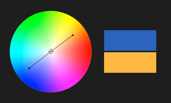
2. Analogous Colors
- Definition: Colors that are next to each other on the color wheel (e.g., blue, teal, and green).
- Effect: Harmonious and calming, creating a sense of unity and cohesion.
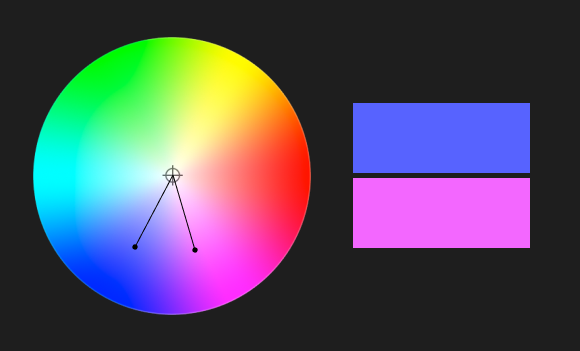
3. Triadic Colors
- Definition: Three colors evenly spaced around the color wheel (e.g., red, blue, and yellow).
- Effect: Balanced yet vibrant, offering a rich and dynamic palette while maintaining harmony.
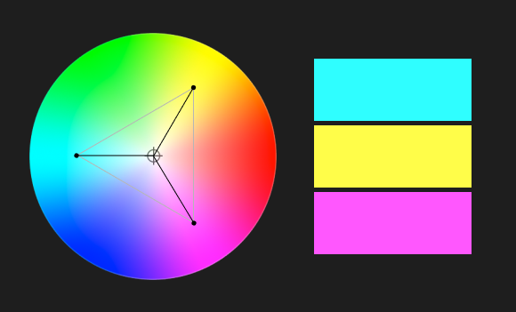
4. Split-Complementary Colors
- Definition: One base color and two colors adjacent to its complementary color (e.g., blue with red-orange and yellow-orange).
- Effect: High contrast with less tension than complementary colors, providing vibrancy with balance.
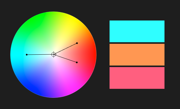
5. Tetradic (Rectangle) Colors
- Definition: Two complementary color pairs (e.g., blue and orange, green and red).
- Effect: Rich and versatile, allowing diverse combinations, but requiring careful balance to avoid overwhelming the viewer.
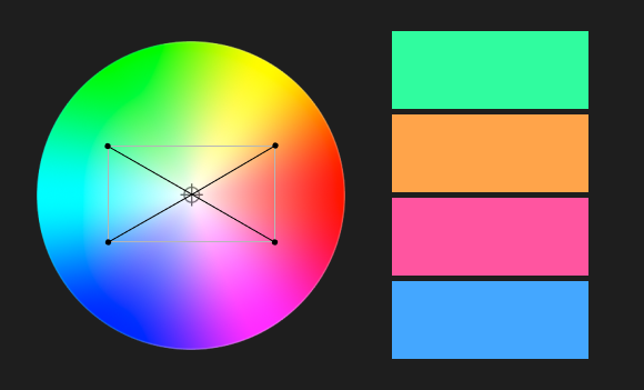
6. Square Colors
- Definition: Four colors evenly spaced around the color wheel (e.g., yellow, blue-green, purple, and red-orange).
- Effect: Similar to tetradic but more evenly balanced, providing vibrant diversity in a design or grade.
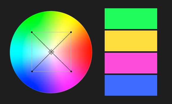
7. Monochromatic Colors
- Definition: Variations in lightness and saturation of a single color.
- Effect: Sophisticated and unified, often used to convey subtle emotional nuances.
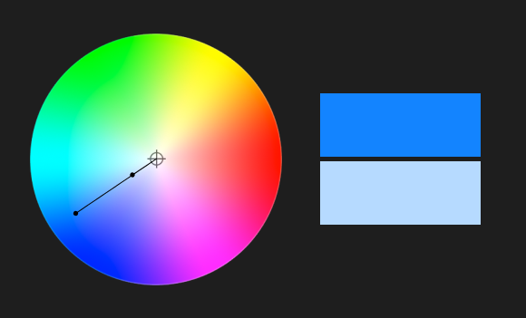
8. Warm and Cool Colors
- Definition: Warm colors include reds, oranges, and yellows, while cool colors include blues, greens, and purples.
- Effect: Warm colors evoke energy, excitement, and warmth, while cool colors convey calm, sadness, or tranquility.
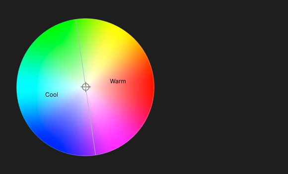
9. Neutral Accents
- Definition: Combining neutral tones (grays, blacks, whites) with pops of color.
- Effect: Highlights certain elements while maintaining an elegant or minimalistic feel.
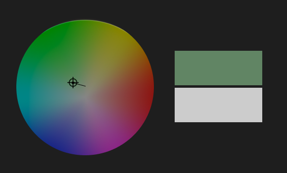
For your course, you could pair these explanations with practical examples, showing how these combinations are used in films to evoke specific emotions or set the mood of a scene.
The pshycology of color
Why It’s Important: As a colorist, understanding the emotional impact of colors allows you to evoke the right feelings in your audience. Color psychology helps you align visual tones with storytelling goals.
Practical Application: Use color to intensify emotions in a scene—red for danger, blue for calm. For example, grading a thriller with desaturated greens can heighten unease.
- General Emotional Associations:
- Red: Passion, danger, aggression, love.
- Blue: Calm, trust, sadness, coldness.
- Green: Nature, health, jealousy, wealth.
- Yellow: Joy, energy, caution, anxiety.
- Purple: Luxury, mystery, spirituality.
- Cultural Variations:
- White for purity (Western) vs. mourning (Eastern).
- Red for good fortune (China) vs. warning (Western).
- Applications in Color Grading:
- How to choose colors to match the emotional tone of a scene.
- Examples from films where specific colors shaped the narrative.
Color temperature
Why It’s Important: Knowing how warm and cool colors affect mood is essential for balancing scenes and enhancing atmosphere.
Practical Application: Adjust white balance to maintain continuity or create contrast. For example, make a flashback scene warm and nostalgic while keeping the present-day scenes cool and detached.
- Key Concepts:
- Warm Colors: Red, orange, yellow—evoke energy, intimacy, or danger.
- Cool Colors: Blue, green, purple—evoke calm, sadness, or detachment.
- Color Balance in DaVinci Resolve:
- Adjusting white balance for natural or stylized tones.
- Using temperature and tint sliders for fine-tuning.
- Examples:
- Warm tones in romantic or nostalgic scenes (La La Land).
- Cool tones in thriller or sci-fi (Blade Runner 2049).
Luminance and contrast
Why It’s Important: Brightness and contrast guide the viewer’s focus and influence how a scene feels. Low luminance creates mystery, while high luminance adds clarity and energy.
Practical Application: Use contrast to direct attention. For instance, make a protagonist’s face stand out by brightening it against a darker background.
- Key Concepts:
- Luminance: The brightness of colors.
- Contrast: The difference between light and dark areas.
- Applications in Storytelling:
- High contrast for drama or tension.
- Low contrast for softer, dream-like visuals.
- Practical Tools in DaVinci Resolve:
- Adjusting shadows, midtones, and highlights in color wheels.
- Using curves for precise luminance adjustments.
Saturation and desaturation
Why It’s Important: Controlling saturation allows you to adjust the intensity of colors, which impacts the energy or realism of a scene.
Practical Application: Add saturation to highlight joy or energy in a scene, or reduce it for a grittier, more grounded tone, such as in a war film.
- Key Concepts:
- Saturated Colors: Energy, excitement, boldness.
- Desaturated Colors: Subtlety, realism, somberness.
- Applications:
- Bold colors for energetic scenes (The Grand Budapest Hotel).
- Muted tones for dystopian or melancholic moods (The Road).
- Practical Exercises:
- Gradually desaturate an image to study emotional shifts.
- Use DaVinci Resolve’s Hue vs. Saturation curves to isolate changes.
Color hierarchy and focus
Why It’s Important: Understanding color hierarchy lets you use color as a storytelling tool, guiding viewers to key elements.
Practical Application: Highlight a specific object (e.g., a red balloon in a neutral-toned scene) to subtly convey importance or symbolism.
- Key Concepts:
- Dominant Colors: The most visually striking color in a frame.
- Supporting Colors: Secondary elements that complement the dominant color.
- Techniques in Resolve:
- Using power windows to isolate focus areas.
- Enhancing specific colors to guide viewer attention.
- Examples:
- Bright red coat in a muted scene (Schindler’s List).
- Highlighting a character’s face with subtle color contrasts.
The role of skin tones in grading
Why It’s Important: Accurate skin tones ensure believability and connection with characters. Poorly balanced skin tones can distract viewers.
Practical Application: Use scopes to keep skin tones natural, even when the overall grade involves strong color styling, like teal and orange.
- Key Concepts:
- Skin Tone Line: The reference line on the vectorscope for natural skin tones.
- Common pitfalls in overcorrecting skin tones.
- Practical Tools:
- Using the qualifier tool to isolate and adjust skin tones.
- Matching skin tones across different shots.
- Examples:
- How overly warm or cool skin tones affect realism and mood.
Color grading styles and genres
Why It’s Important: Each genre has distinct visual language and expectations. Mastering these styles ensures your work aligns with the creative vision.
Practical Application: Apply teal and orange to action sequences or pastel palettes for romantic comedies, maintaining consistency with genre conventions.
- Key Concepts:
- Action: Teal and orange for intensity.
- Horror: Desaturated greens and blues for unease.
- Romance: Warm pinks and golds for intimacy.
- Practical Tools:
- Creating genre-specific looks with LUTs.
- Analyzing color palettes from famous movies.
Color in narrative progression
Why It’s Important: Colors that evolve with the story add depth to the narrative, subtly signaling shifts in tone or character arcs.
Practical Application: Transition from vibrant to muted tones to depict a character’s emotional decline, as seen in The Social Network.
- Key Concepts:
- Dynamic color shifts: Warm to cool for emotional decline.
- Subtle transitions to signify hope or despair.
- Examples:
- Her: Shifting palettes as relationships evolve.
- Breaking Bad: Gradual desaturation over seasons.
The role of light in color perception
Why It’s Important: Light dramatically impacts how colors are perceived, influencing mood and focus. Mastering this interplay is key to achieving desired effects.
Practical Application: Balance shadows and highlights to create depth. For example, use soft, diffused light for romantic scenes or harsh, directional light for tension.
- Key Concepts:
- Interaction between light, shadow, and color.
- The role of key light, fill light, and backlight.
- Practical Tools:
- Working with shadow and highlight tools in Resolve.
- Using scopes to maintain light balance.
Color paletts for branding
Why It’s Important: Branding relies on consistent color schemes to convey identity and emotion. As a colorist, your work should align with these guidelines.
Practical Application: Match the brand’s colors while enhancing the visual appeal, such as maintaining Coca-Cola’s iconic red in a commercial while balancing complementary tones.
- Key Concepts:
- Brand identity through color: McDonald’s red and yellow.
- Designing mood boards for client approval.
- Practical Tools:
- Matching reference images in Resolve.
- Using color match features.
Practical application in Davinci Resolve
Why It’s Important: DaVinci Resolve’s tools are the foundation for applying color theory in professional workflows.
Practical Application: Use primary color wheels for broad adjustments, secondary tools for isolating colors, and scopes to monitor accuracy during grading.
- Key Tools:
- Color wheels for primary corrections.
- Qualifiers and masks for secondary corrections.
- Scopes: Vectorscope, waveform, and histogram.
- Exercises:
- Correct a poorly balanced image.
- Stylize a clip with a genre-specific look.
Creative color grading techniques
Why It’s Important: Breaking conventional rules can lead to unique, memorable visuals that stand out. Creativity distinguishes a skilled colorist.
Practical Application: Apply unconventional palettes to surreal scenes, such as exaggerated neon hues for dream sequences, as in Spring Breakers.
- Key Concepts:
- Non-traditional palettes for surreal effects (Amélie).
- Using split toning for vintage aesthetics.
- Practical Exercises:
- Experiment with unexpected color combinations.
Case studies of iconic films
Why It’s Important: Studying successful films provides insight into how color theory is used effectively in storytelling.
Practical Application: Analyze and replicate iconic looks in Resolve to practice applying theoretical knowledge, such as mimicking The Matrix’s green tint for digital environments.
- Films to Study:
- The Grand Budapest Hotel: Bold, symmetrical palettes.
- The Matrix: Green tints for digital world sequences.
- Mad Max: Fury Road: High-contrast, oversaturated orange and teal.
- Practical Analysis:
- Recreate iconic looks in Resolve.
The science of color perception
Why It’s Important: Understanding how humans perceive color helps avoid issues like poor visibility or inaccessible design choices.
Practical Application: Test your grade for accessibility, ensuring readability and emotional clarity for all viewers, including those with color blindness.
- Key Concepts:
- How the eye perceives color through cones.
- Challenges like color blindness and adapting palettes for accessibility.
- Applications in Resolve:
- Simulating color blindness filters to test accessibility.
Creating an emotion
1. The Approach to Creating Emotion
Crafting emotion is about aligning visual tone with the narrative’s emotional undercurrent. Each element—color palette, contrast, saturation, and brightness—contributes to the viewer’s emotional response.
Steps to Take:
- Understand the Story: Know the emotional beats of the scene or project. What emotion should the audience feel?
- Define the Palette: Select colors that resonate with the intended emotion based on color theory.
- Match the Genre: Balance creativity with audience expectations for the genre.
- Experiment and Refine: Test multiple looks and refine until the emotion feels authentic and impactful.
- Collaborate with Directors: Understand their vision to align your grading choices with the creative direction.
Tools to Use in DaVinci Resolve:
- Color wheels for mood adjustment.
- Qualifiers and masks for isolating emotional highlights.
- LUTs for specific looks.
2. Breaking Down Emotions Through Color Grading
Happiness
Key Characteristics: Bright, warm, and vibrant colors. High saturation and balanced contrast create an uplifting feel.
Colors: Yellow, orange, light green, pastel pinks.
Applications:
- Saturated yellows for scenes of joy (La La Land).
- Soft highlights and low contrast for a dreamy, cheerful look.
Sadness
Key Characteristics: Cool tones, muted colors, and low saturation create a somber or reflective atmosphere.
Colors: Blue, gray, desaturated purples.
Applications:
- Desaturation for emotional depth, like in Manchester by the Sea.
- Shadows and soft contrast to convey melancholy.
Anger
Key Characteristics: Bold, aggressive tones with sharp contrast and deep shadows.
Colors: Red, black, fiery orange.
Applications:
- Using red hues to amplify intensity (Whiplash).
- High contrast and darker midtones for a visceral impact.
Fear/Tension
Key Characteristics: Dark, desaturated colors with strong shadows and stark lighting contrasts.
Colors: Dark green, blue, muted grays.
Applications:
- Desaturated greens and blues for unease (The Ring).
- High shadow-to-light contrast to build tension (The Lighthouse).
Love/Romance
Key Characteristics: Warm, soft tones with gentle contrast.
Colors: Pink, red, pastel hues, golden light.
Applications:
- Warm gold hues for intimacy (Call Me by Your Name).
- Diffused lighting for a soft, romantic atmosphere.
Nostalgia
Key Characteristics: Warm, vintage hues with soft contrast and a slight desaturation.
Colors: Sepia tones, muted golds, browns.
Applications:
- Using LUTs for a retro look (Amélie).
- Adding grain to enhance the vintage feel.
Hope/Inspiration
Key Characteristics: Bright, uplifting colors with balanced contrast and a sense of clarity.
Colors: Bright blue, yellow, white highlights.
Applications:
- Vibrant blues and whites for an optimistic tone (Interstellar).
- Gradual transitions from darkness to light to symbolize hope.
Isolation/Loneliness
Key Characteristics: Muted, cold tones with low saturation and minimal contrast.
Colors: Cool grays, blues, greens.
Applications:
- Desaturated greens to amplify isolation (Joker).
- Wide shots with neutral tones to enhance the feeling of space and solitude.
Color grading tips and tricks
1. Split Toning
Overview: Enhance mood by separately adjusting highlights and shadows.
How to Apply: Use DaVinci Resolve’s split-toning feature or curves. For example, add warm tones (orange) to highlights and cool tones (blue) to shadows for cinematic contrast.
2. Use Scopes Religiously
Overview: Scopes help ensure technical accuracy while grading.
Tips:
- Vectorscope: Ensure skin tones align with the skin tone line.
- Waveform: Balance luminance for a consistent look.
- Histogram: Identify and correct exposure issues.
3. Match Shots Across a Scene
Overview: Ensure consistency between shots within a sequence.
How to Apply: Use the Color Match feature in DaVinci Resolve, then fine-tune using manual adjustments to maintain continuity in brightness, contrast, and color temperature.
4. Balance First, Stylize Later
Overview: Start with basic corrections before diving into creative grading.
Tip: Adjust exposure, white balance, and contrast in the primary wheels before applying LUTs or secondary adjustments.
5. Leverage LUTs Wisely
Overview: LUTs are powerful but should enhance your grade, not replace it.
Tip: Use LUTs for initial looks, but always refine with manual adjustments to tailor the grade to your footage.
6. Use Power Windows for Targeted Adjustments
Overview: Focus on specific areas in the frame for precise color or exposure adjustments.
How to Apply: Isolate a subject’s face with a circular window to brighten it subtly while darkening the background for emphasis.
7. Play with Contrast for Depth
Overview: Adjust contrast to create depth and dimension.
Tip: Use soft contrast for a dreamy feel or strong contrast for dramatic intensity. Combine with shadows/highlights adjustments for a refined look.
8. Experiment with HSL Qualifiers
Overview: Select and manipulate specific colors for creative control.
How to Apply: For instance, change a green shirt to blue by selecting it with the HSL qualifier and adjusting hue and saturation sliders.
9. Work in Nodes
Overview: Nodes allow for non-destructive, layered grading.
Tip: Create separate nodes for each adjustment (e.g., exposure, skin tones, creative look) to maintain flexibility.
10. Use Film Grain for Texture
Overview: Add film grain to achieve a cinematic, organic feel.
How to Apply: Use Resolve’s film grain effect to introduce subtle texture, matching the intensity to the mood of the scene.
11. Enhance Skin Tones
Overview: Accurate skin tones are crucial for realism.
Tip: Use the qualifier tool to isolate skin tones and adjust them on the vectorscope. Avoid oversaturation or unnatural hues.
12. Use the Shadows and Highlights Effectively
Overview: Adjust shadows and highlights to bring out details without crushing blacks or blowing out whites.
Tip: Use Resolve’s Shadow and Highlight sliders or curves for subtle control.
13. Create Pop with Local Contrast
Overview: Add micro-contrast to make details stand out.
How to Apply: Use the midtone detail slider to enhance textures without over-sharpening.
14. Utilize Color Blending Modes
Overview: Combine colors creatively by changing blending modes in Resolve.
Tip: Overlay warm tones for sunsets or cool tones for underwater scenes using layer nodes.
15. Add Depth with Vignettes
Overview: Draw focus to the subject by darkening or brightening edges.
How to Apply: Use power windows to create and adjust vignettes subtly.
16. Simulate Day-to-Night
Overview: Convert daytime footage into a convincing night scene.
How to Apply: Lower exposure, desaturate, and tint shadows blue while masking out highlights like the sky for natural results.
17. Enhance Mood with Tinting
Overview: Apply a global tint to evoke mood.
Tip: Use cool tints for eerie scenes or warm ones for comforting atmospheres. Adjust global saturation for balance.
18. Adjust Hue vs. Hue for Stylization
Overview: Change specific hues for creative effects.
How to Apply: For example, shift green trees toward teal for a fantasy vibe or adjust blue skies to a softer cyan.
19. Isolate and Highlight Colors
Overview: Create focus by emphasizing one color while desaturating others.
How to Apply: Use the qualifier to select and boost a single color (e.g., red dress) and reduce saturation for the rest.
20. Study and Recreate References
Overview: Analyze the color grading of films you admire and practice recreating their look.
Tip: Use Resolve’s still gallery to compare your grade side-by-side with reference images for precision.